is a blog about design, technology and culture written by Khoi Vinh, and has been more or less continuously published since December 2000 in New York City. Khoi is currently Principal Designer at Adobe. Previously, Khoi was co-founder and CEO of Mixel (acquired in 2013), Design Director of The New York Times Online, and co-founder of the design studio Behavior, LLC. He is the author of “How They Got There: Interviews with Digital Designers About Their Careers”and “Ordering Disorder: Grid Principles for Web Design,” and was named one of Fast Company’s “fifty most influential designers in America.” Khoi lives in Crown Heights, Brooklyn with his wife and three children.
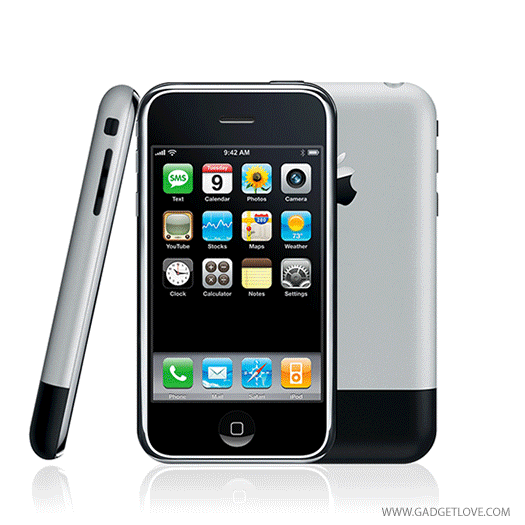
Product review site Gadgetlove.com produced this great little illustration of how the iPhone’s form factor has changed since its debut. Though the latest model, the iPhone 6, is significantly changed from its ancestor, it’s apparent from this animation that in many ways it’s still the same device. The more things change, the more they stay the same, I guess.
Gadgetlove also has similar animations for other phones and game controllers at gadgetlove.com.
In case you missed it today, between awkward speechifying from the likes of Drake and awkward grooving from the likes of Eddie Cue, Apple’s 2015 Worldwide Developers Conference keynote included mention of a number of new, iPad-specific features as part of the forthcoming iOS 9. A few of them, like picture-in-picture support for video players, slide over, and split view, finally take advantage of the iPad’s larger screen real estate by allowing users to see more than one app at a time.
There are also new, improved input methods: a shortcut bar that appears above the software keyboard adds icons for common editing functions like copy/paste and text formatting; more convenient and presumably easier text selection through two-finger gesturing anywhere on the screen; and even enhanced support for external keyboards and command-key shortcuts—including a process switching interface invoked via command-tab.
None of these features is particularly original but they’re notable at least insofar that they hint that Apple might be starting to attend to the iPad with more resources and urgency than it has in recent years. It’s no secret that even though the overall volume of iPad sales remains significant, numbers are clearly trending downwards, and it will take more of these kinds of efforts—many more, perhaps—to reverse that trend.
I’ve written several times that the fact that the iPad has been in virtual lockstep with the iPhone in feature development has been a drag on the former’s evolution. Today’s announced features are a step in the right direction, but you could easily come up with a list of additional features that would dramatically distinguish the iPad from its sibling—and for the better. A few of my favorite would be:
Support for multiple user accounts—this was rumored, alas it was not to be
Ability to receive (not just send) AirPlay audio and video
Universal access to the iOS dock, similar to Control Center
More robust, visually engaging Reader View, perhaps one that’s available within third-party apps as well
A more visually elegant Notification Center that capitalizes on the larger screen real estate
And that’s not even mentioning the hardware improvements that you could make: a Force Touch screen, programmable hardware buttons embedded in the device’s bezel, and improved support for styluses come to mind (though I’m generally not enthusiastic about that last one, in spite of its popularity). The point is, virtually anything that can distinguish these tablets from their smartphone siblings is going to help the cause.
Still, I am heartened by today’s announcements because even the promise of these few improvements seems to be breathe new life into the device. In fact, while watching the keynote, I overheard a colleague say about these features, “I might start using my iPad again.” That’s what we want, Apple, only a lot more of it.
See Apple’s rundown of what’s coming in iOS 9 at apple.com.
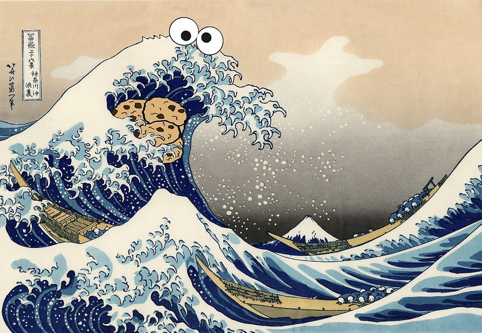
This mashup of Sesame Street’s Cookie Monster and Japanese artist Katsushika Hokusai’s famous painting “Under the Wave off Kanagawa” originated on Reddit two years ago but I’m just seeing it now, thanks to my wife. It cracked me up immensely and seemed as good of a way to start a Monday as any.
You can buy it printed on tee-shirts, iPhone cases, tote bags and more at redbubble.com.
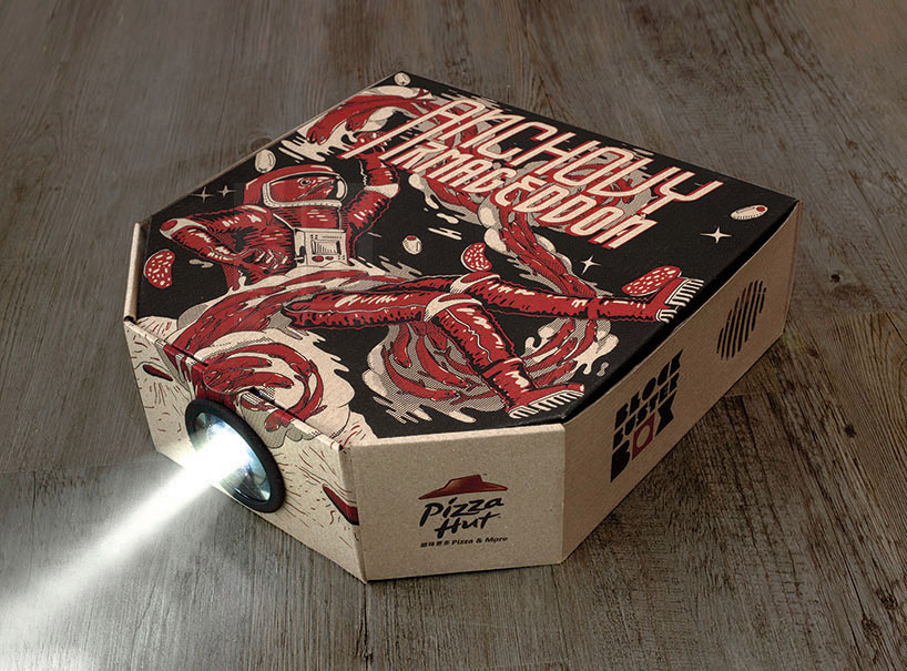
I hesitated to post this because I hate the insidious nature of its wasteful, pointless marketing agenda. Still, I admit there is some cleverness in the way that advertising agency Ogilvy & Mather have redesigned the standard cardboard pizza box to work as a MacGyver-ized video projector.
The box has an extra compartment with a perforation for a camera hole, and the pizza saver support comes with a plastic lens that can be popped out and fitted into that hole. Use your smartphone to scan a QR code that allows you to pick one of the movies from Pizza Hut’s selection (I assume the movies have been edited so that their images are reversed), put the phone inside the box, dim the lights and you’re watching a probably not very high quality image projected on your wall.
It seems unlikely that most consumers would ever use this projector more than once before throwing the contraption in the trash, but the gimmick is still notable as a demonstration of how brands will do almost anything to work up a smartphone angle to their products. This video shows the whole thing in its shameless glory:
This mesmerizing, two-minute time-lapse video captures the construction of One World Trade Center over eleven painful, politically intractable years. Produced by the company EarthCam, it seems like a marvel of meticulous, patient shot-planning; because the sheer mass of its subject changes so dramatically, the camera must pan to accommodate the construction’s progress slowly, over the course of years. (In fact, EarthCam has pledged to keep documenting the continued evolution of this landmark “for future generations.”) Two minutes is appropriately bite-sized for Internet consumption, but I could do with a version of this that runs for ten or twenty minutes at least—as a viewer I want more time to pore over the particulars of the monolith coming into being.
A side note about the design of One World Trade, now that it’s finally done. I’m not overly taken with its form, but I do think that it accomplishes at least one goal for a landmark loaded with such high expectations: its design is distinctive and easily recognizable, and yet still visually simple and comprehensible enough that a child can draw it easily. That’s part of what makes the world’s mot iconic monuments—the Eiffel Tower, the Pyramid of Giza, the Washington Monument and a few others—so successful. I’m not saying that this tower is as timeless as those, but it does satisfy at least that one qualification.
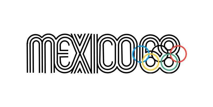
Type designer Thomas Jockin designed this typeface based on the famous multi-line graphics of the 1968 Summer Olympic Games in Mexico City. To be clear, Azote is not a direct revival of that event’s typography but rather takes inspiration from the same multi-line concept; as fonts in the Azote family get heavier, the thickness is created with additional lines, similar to the ’68 Games’ logo.
Azote Bold Italic, in particular, pulls off this trickier-than-it-sounds idea very nicely. It achieves a clever balance of mass and openness by tempering both with an italic swagger that’s quite pleasing at larger scales (though it would probably be impractical at anything but display sizes). Overall a really nice bit of type design.
O’Reilly Media is holding its first ever O’Reilly Design Conference next January in San Francisco. The team organizing it is committed to delivering “the nuts-and-bolts foundations for sharpening your skills—the latest tools, techniques, and technologies you need to create innovative products and service—alongside forward-looking insights and inspiration.” (Full disclosure: I’m a member of the program committee.)
As of today, the conference’s call for proposals is officially open. Solicitations are being encouraged in three broad areas of interest that program chair Mary Treseler describes in this blog post as forming the basis of the conference’s tracks:
Designing for [the Internet of Things] represents a more dramatic change for designers than iterations from print to Web and Web to mobile. It also renews the importance of fundamental skills, such as user research and information architecture.
Design is a core business asset. It’s no surprise that design can provide a competitive edge, but shifting a business into a design-embedded organization is not simple nor easy.
Design for a Greater Good: design’s social impact is stronger than ever. Good design has the ability to improve our lives and our world.
Details on submitting ideas for talks and panels can be found here—proposals will be accepted through 20 July 2015. It promises to be a fascinating event, so if you’re working on something you think the design world needs to hear about, I hope you’ll share it with us.
You can find more information on the conference at this site. Oh, and apparently this particular O’Reilly production has been assigned the Tufted Coquette, a kind of South American hummingbird, as its animal kingdom embodiment. That’s what you see at the top of this post!
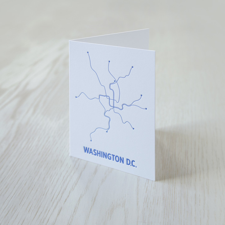
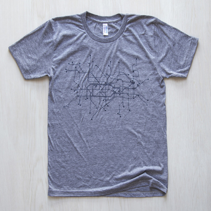
If you find something transfixing and lovely about public transportation maps then you’re not alone. You can now buy a notecard with the Washington, D.C. Metro System on it, or a pint glass with Brooklyn, NY bike routes on it, or a tee-shirt of the London Underground. All these maps (and many more from many different cities) are denuded of their text labels and so exist as beautiful, vaguely recognizable semi-organic forms—urban fractals, maybe. These all come from LinePosters, which “sells modern, graphic interpretations of popular city transit systems.” They all look really sharp, to my eye.
Find just the right gear you’re looking for from among the many different products featuring many different transit maps that they have available at lineposters.com.
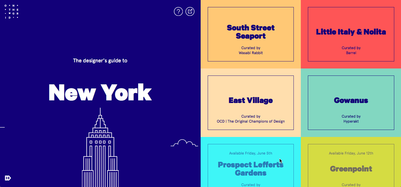
This is one of those terrific, wish-I’d-thought-of-that ideas that you can’t help but be charmed by: a neighborhood-by-neighborhood guide to New York City put together by Hyperakt, a design studio in Brooklyn. Each guide is curated by one of the city’s prominent designers or design shops—there are some great names here. The first four are available now, curated by Hyperakt, Wasabi Rabbit, Wildcard’s upstairs neighbors Barrel, and my good friends at OCD The Original Champions of Design. Twenty-two more guides are coming at some point, which raises my only complaint about the project: there’s no email form for those who want to be notified as they’re released. See the project at onthegrid.city.
TL;DR: Today I’m launching a survey of the tools that digital designers are using in their work. It will run for a week and the results will be made public.
Update 11 Jun 2015: The survey is now closed. Thanks to all that have taken part; I plan to present the findings within a few weeks.
Background
Last month I shared what I learned about popular design tools during an informal mini-tour of several New York City design teams. It was fascinating for me to hear what’s actually in use at some of the best shops in the city, how new tools and workflows are being adopted, and to compare all that with what gets published in the places where designers gather online. Much of what I heard was consistent with what we read on blogs, Medium posts and Designer News, but there was also a lot of nuance that doesn’t seem to surface in those forums—like how Sketch has an air of inevitability that’s greater even than its actual adoption—and also a few undercurrents that get rarely mentioned—like how there are actual, apparently sane people who swear by InDesign for user interface design. Wild stuff.
Of course, as I readily admitted in the title of my blog post, what I learned was flatly unscientific. In some ways, that’s not inherently bad; the challenge of assessing this space with true statistical accuracy is probably more trouble than it’s worth (unless you’re a venture capitalist). Still it would probably be valuable to get a broader understanding of these trends, at least to ensure that what I heard is representative of more than just the handful of teams I visited.
Short of replicating that tour on a larger scale and in more cities than just New York, I realized that there’s a lot that can be learned with a simple, online survey—which is what I present to you today.
Survey closed
This is a comprehensive though simple questionnaire that asks what software you as a designer are using for brainstorming, wireframing, interface design, prototyping, project management and version control. The questions are almost all multiple choice, and it takes less than five minutes to complete. Please head over there and participate right now!
I built this with the elegant survey tools from the superb Typeform service, though as you’ll see when you take it, there are a few shortcomings in the way the logic flows owing to Typeform limitations. Still, I think you’ll find that it’s pretty straightforward.
My intention is to run this survey for a week and then to publish a blog post that summarizes the findings. I’ll also publish the complete results data (excepting any emails or other personal data) for those who are interested. The survey is not sponsored or underwritten by any company; it’s purely for my own curiosity and for the benefit of the design community at large. Please take a few minutes to register your answers and then share it with all the designers you know. Thank you!