is a blog about design, technology and culture written by Khoi Vinh, and has been more or less continuously published since December 2000 in New York City. Khoi is currently Principal Designer at Adobe. Previously, Khoi was co-founder and CEO of Mixel (acquired in 2013), Design Director of The New York Times Online, and co-founder of the design studio Behavior, LLC. He is the author of “How They Got There: Interviews with Digital Designers About Their Careers”and “Ordering Disorder: Grid Principles for Web Design,” and was named one of Fast Company’s “fifty most influential designers in America.” Khoi lives in Crown Heights, Brooklyn with his wife and three children.
London-based creative agency Territory Studio created “more than 200 screens and 80 minutes of unique animations across all 11 sets” for this year’s won’t-be-denied cinematic blockbuster “Avengers: Age of Ultron.” Their hypothetical user interfaces are elaborately constructed and intricately animated, and they’re clearly higher in quality than similar AfterEffects projects that can be had for surprisingly cheap via Evato and other design marketplaces. But the difference is a matter of degrees and not miles, I think.
While Territory’s work is impressive, this project doesn’t showcase any particularly new ideas. In fact, I’m a bit weary of this school of UI aesthetic for the silver screen; not only does it seem highly commodified (i.e., these UIs always look the same in every movie), but the style is looking less and less like what real user interfaces will look like in the future.
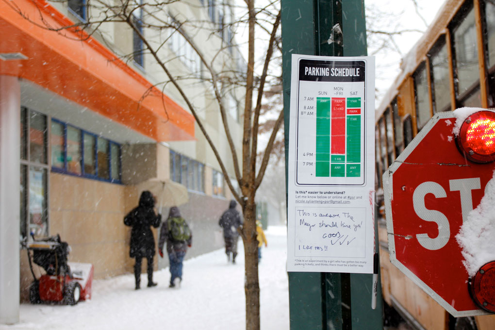
Above: Sylianteng’s original guerrilla signs have started to become reality.
A little more than a year ago I posted an article about designer Nikki Sylianteng’s To Park or Not to Park project, in which she undertook a guerrilla campaign to bring her reworked, demonstrably clearer versions of real parking signs to the streets of New York City. At that time, the project was already attracting tons of notice from the press; it has since continued to blossom in impressive ways. Several municipalities around the world have started to re-examine their own parking signs with the aim of emulating Sylianteng’s work, and one major city, Los Angeles, has even started pilot testing versions of her designs in its downtown area. I thought it was a good time to ask her over email about her thoughts on the project’s progress and where she hopes to take it.
Khoi Vinh: Last year this was a really interesting side project, but now these signs are becoming reality. Have you been surprised by the life this has taken on?
Nikki Sylianteng: I am surprised. Mostly because there are a lot of people who believe that cities intentionally keep parking signs confusing because it’s a huge revenue source for them. So I expected someone on the city side to have shot it down by now. So far though, from what I’ve heard at the transportation hearing in LA and other cities who’ve expressed interest, that hasn’t been the case.
So that’s a remarkable story—do I understand it correctly than an L.A. city council member just happened across your work? Did he consult you before he put it before the council?
Yes, I think they read about the project on Wired, then I got an email from his policy director asking for my permission to attach a mockup of the sign to a motion to be introduced in Council.
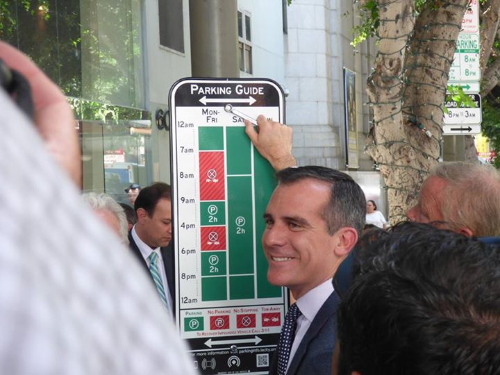
What was your reaction to the one hundred trial street signs based on your ideas that L.A. posted earlier this month?
It’s the first official trial so it’s pretty exciting. The sign has its limitations so I’m curious to see how it pans out and what effect it will have on parking tickets. One thing I noticed is they seem to have gone out of their way to change aspects of the design even though I’d given them templates. I wonder what the motivations are and if this will keep happening. Also, I’ve been so focused on the ordinary driver/neighborhood activist, but it’s probably time to directly address cities.
Los Angeles Mayor Eric Garcetti unveils a pilot test of new parking signs based on Sylianteng’s designs.
Was that a moment when you suddenly recognized new potential for the project, or had something like this always been in the back of your mind?
I think it happened a couple months before [the L.A. city council first took it up], after I did the colorblind studies which was also around the first time you picked it up for Subtraction.com. All these articles were coming out talking about how I was trying to change the system. I don’t think I was thinking that far ahead when I started but when I heard that, it made me think “Am I? Is that what I’m trying to do? Maybe it is?”
When I put the first sign up, I had just come back from L.A. where I got a US$95 parking ticket in downtown. It just so happened I was also looking for a personal project to work on at the time. Getting the ticket reminded me of an old parking sign redesign concept I did before grad school that was just sitting in my portfolio. I knew a few of my non-designer friends could really relate to it which is important to me so I thought maybe I should at least find out whether it also made sense to other people.
There is a project in France called Fabrique-Hacktion that I love. I’ve always been drawn to these types of projects so I approached this as something similar. I can’t say it was completely out of my mind though because I’ve always wanted to do a project like Deborah Adler’s ClearRx. But like I said, there’s this perception that it was highly unlikely because it goes against government interests so I’m surprised by how well it’s been received.
Is that “change the system” impulse something that’s consistent in your work, or in your life? It takes a certain gumption to take on bureaucracy in this way where you’re saying, “This is all wrong, let me show you how to do it right.”
Hah, that’s a loaded question.
Questioning the system is more like it. Especially when it goes against what you would think is common sense. It’s less about gumption and more about curiosity and an impulse to understand why things are the way they are. Why do parking signs have to be so complicated? Do cities just have other priorities? Do they even think they’re broken? Are they intentionally confusing us? I don’t pretend to know but I want to find out.
When I was younger, even if things didn’t make sense, I assumed there was a good reason for it. Some expert must have thought about this already, right? But the older I get, the more I realize that’s not always true. I’ve become very skeptical of the assumption that “that’s just the way things are”.
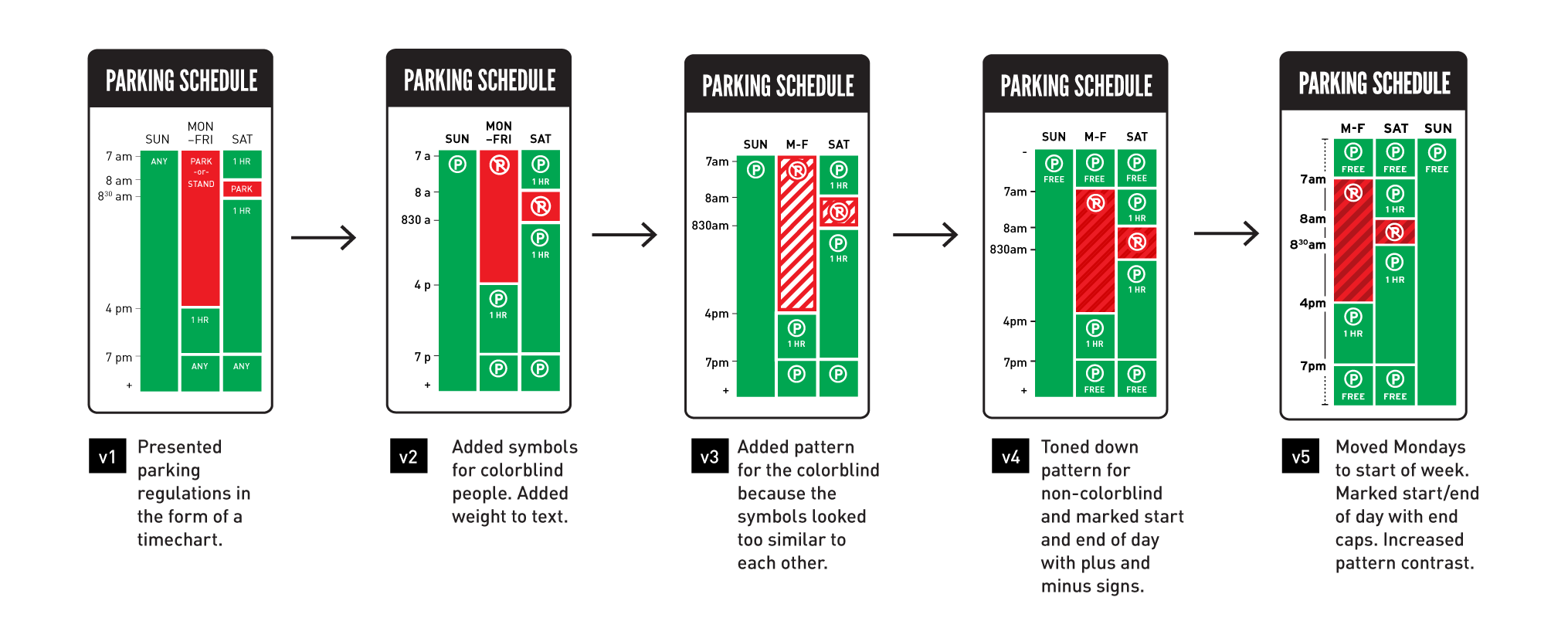
Above: The design evolution of Sylianteng’s parking signs.
Okay so, maybe it’s too early to say definitively, but what’s your best guess to date for the answers to those questions? Particularly, “Are they intentionally confusing us?” I bet a lot of people suspect the answer is yes.
This may be the eternal optimist in me but so far my answer is no. You really can’t generalize.
Several cities have expressed interest in trialing the new sign and if you listened to the transportation committee hearing in LA, it wouldn’t be so easy to say yes.
I spoke to fellow frustrated driver Michael Brouillet who met with traffic engineers in Santa Monica. He said “meeting the people that actually design the parking signs we find so confusing and hearing their own frustrations of state and federal laws that tie their hands in terms of design, I felt naïve that I used to believe that they were almost intentionally trying to confuse us.”
It seems more a matter of lack of ideas, priorities, and bureaucracy than malicious intent.
They look good and are probably the best they can be, considering the constraints. Functionally, I’ve heard they’re harder to read because the type seems smaller. I don’t drive here so I can’t speak from experience.
Do you think there’s any hope that these municipalities can internalize good design well enough to do this on their own, without having to hire a firm like Pentagram?
They might always need to contract it out. Is there a municipality in the world that does it well in-house? Maybe in Europe?
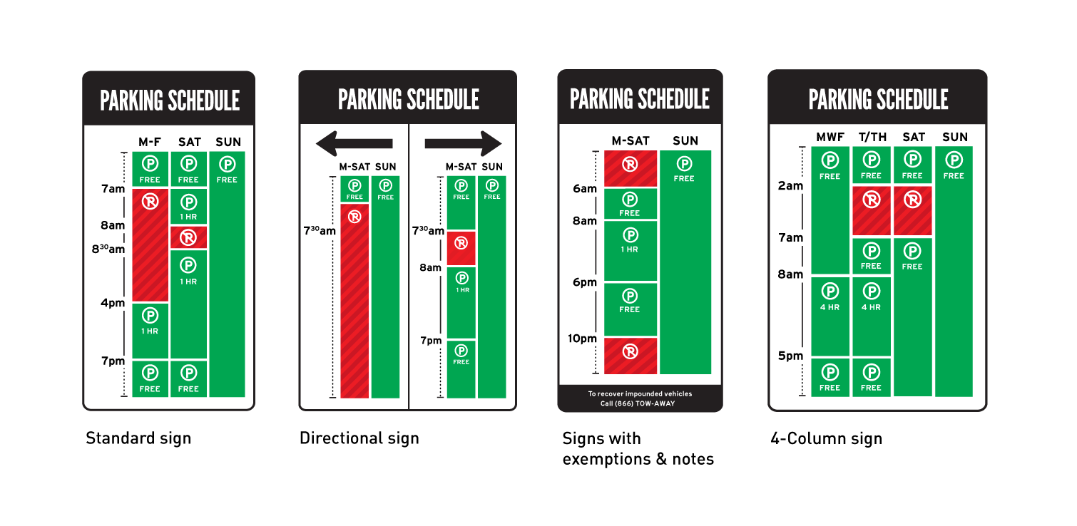
Above: The latest versions of Sylianteng’s parking sign designs.
One thing that stands out when you compare Pentagram’s New York signs and the pilot signs that L.A. produced is that the former are fairly impressive typographically while the latter are a bit of a letdown. Is that aspect of the design important to you when you think about the success of this project?
In terms of getting qualitative feedback, it is important because it creates an emotional reaction in the person reading the sign which can affect their comprehension. I’ve read reports about some signs getting mixed reactions and I can understand why.
On a broader level, the problem with parking signs is really a systemic one. Solving it means asking questions like: How do confusing signs get in front of drivers in the first place? What makes them perform so poorly over time? And how can a new design or framework fix this? In that sense, L.A.’s pilot is pushing that conversation forward.
What are your plans for the project going forward?
I need to establish clear guidelines and next steps for cities who want to do a trial. Then it’s just a matter of seeing what happens.
Eventually though I’d like it to be self-sustaining. I’ve thought about having local reps of some sort, just like how I have my colorblind council and friendly neighborhood spies. I’ve also thought about bringing people in to help or collaborate. I have a lot of ideas from merchandise to quizzes to a Patreon to a picture book…I can see myself working on this project forever, which I love, but I’d like to work on other projects too! My goal is to do both.
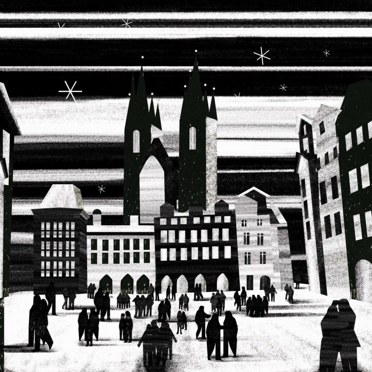
I’m a fan of the work of Italian-born New York illustrator Michela Buttignol. Her aesthetic is spare and contemplative, though not cold or impersonal. Her simple, rough-hewn tableaus feel to me like stills from a stop-motion film that Fellini might have directed with Matisse’s paper cut-outs.
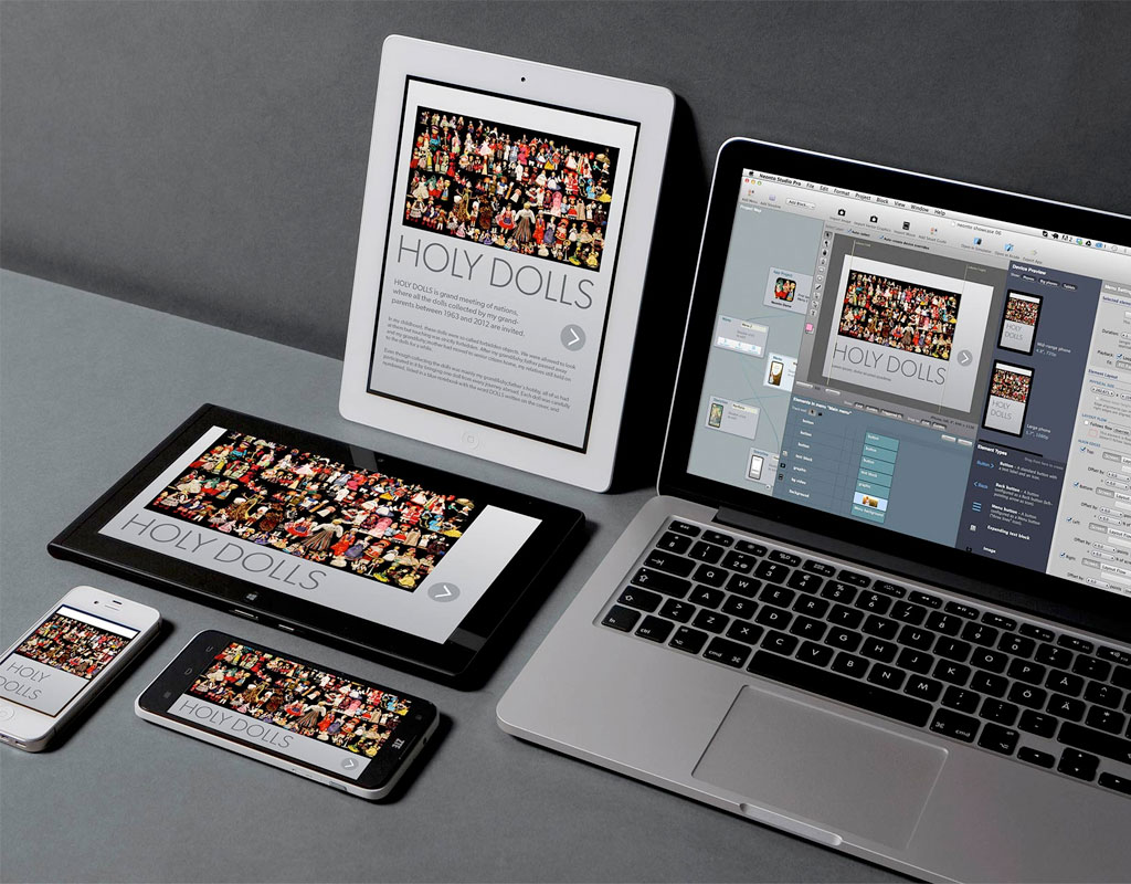
The promising prototyping app Neonto Studio is one of a few surprising tools that readers wrote in about.Last week I published a post titled “The State of Design Tools: An Unscientific Survey” that summarized some of the trends I saw on a mini-tour of five design teams here in New York City (plus one public event). It generated a lot of interesting comments, both about the trends and tools I mentioned and the ones that I didn’t. Here are a selection of them, anonymized in the interests of those who wrote in.
On the topic of Sketch adoption, which I said was lower than expected, one reader wrote about his experiences in the startup world:
I’m always interested in how software adoption (and habits more broadly) drastically differ from region to region. In this case, Sketch’s significant traction in Boulder, Colorado stands in stark contrast to your findings. I would say most—if not nearly all—designers use it here. I moved to Boulder fifteen months ago (former New Yorker) and took my company through Techstars. In that program, every team that had in-house design used Sketch, and all of those designers encouraged me to jump ship from Adobe. So far the switch has been a good decision…Obviously, like with everything else, I scream at the screen from time to time!
Now we’re based out of a large, tech-focused co-working space and when you walk around all you see open is Sketch. After moving to Boulder, I can’t remember the last time I saw a designer working in Photoshop.
I don’t doubt that lots of early stage startups use Sketch as their primary tool these days. But I’m less convinced that when you look in aggregate at design teams of many different types that you would see similar results. All the same, one reader from a well-known tech giant wrote:
I work for [a very large tech company] and Sketch use amongst designers here is rampant. I would say most of the 800+ person design community here now uses Sketch as their default (and only) design tool.
On the topic of prototyping, that reader also said:
You’re right, however, that prototyping tools are still all over the map. I’m seeing the most enthusiasm here for Tumult Hype, which is not on your list.
I hadn’t even heard of Tumult Hype before, which looks great. Nor had I heard of Neonto Studio, which was brought to my attention by one of its developers:
What Neonto Studio does is superficially quite similar to the app prototyping tools you mention (Pixate, etc). But the major difference is that Neonto generates real, useful code for iOS and Android. You can export a whole App Store-ready app, or hand the code over to a developer for further work. There’s no cross-platform runtime, framework or HTML5 involved—the output is ‘real iOS’ and ‘real Android’ from visual blueprints.
That looks fantastic; I’ve added it to my list of tools to try. Back to interface design, one reader wrote effusively about Affinity Designer:
It’s early days but the app has already proved its sophistication and usability in the features already rolled out and it has enormous momentum behind it. The team is steadily delivering on all their promises, with multiple artboards and a large canvas coming soon—at which point it will really start to take its place as the natural heir to that mighty app treated so scornfully by Adobe: Freehand. Adobe really should be afraid; Affinity is an app developed by a team with a real passion to excite designers. It has solid roots in Freehand’s stellar usability but is coded from the ground up as a thoroughly modern app that can deliver fully for different media. On top of this, Affinity’s masterstroke is to establish a common file format across its illustration (Designer), image editing, and layout apps, while maintaining pathways to Adobe products from Illustrator through to Photoshop to yes…Freehand. No I don’t work for Affinity, I’m just a very, very grateful designer who has waited something like a decade (since the last Freehand release) for this. Like Rip Van Winkle, the vector space is just awaking to a very new world.
There are still Freehand diehards out there, apparently. Similarly, I received one or two comments from folks who are still using Fireworks and who lament Adobe’s decision not to continue to evolve that.
Also in the category of “Adobe-related Surprises” is InDesign. We did hear about InDesign use for UX work during our mini-tour, actually, which I probably should have mentioned in my original post. But readers seem to be pushing its limits further than I would have guessed possible:
I’m curious about the absence of InDesign in your list. Can I assume there weren’t many print designers involved in the survey? In my previous job we worked solely on native app development and InDesign was actually a well suited tool, primarily due to its excellent exporting options. Plus we could use the DPS tools for high-fidelity prototyping.
Another reader went into much greater detail about how integral InDesign is the work that he does:
I started using InDesign extensively a few years back when freelancing. I was doing print and web design and I could just use the same tool for everything. Seeing as I was no longer doing any Flash websites but more and more text-heavy websites and apps, working with InDesign felt much more natural. It just made sense.
When I see discussions around our tools, I often think to myself that we don’t face these problems, InDesign covers all our needs. Here are a few reasons on why I love InDesign:
Grids. No need to rely on layers or third party plugins, the grid tools are just there Vector based No need to explain. And it’s easy to export at any given resolution.
Masters. This is super efficient. We usually work on a master and then create the different states on pages. If we need to change a text or move an element, we just have to do it once and it automaticaly appears on all pages. Using masters and page, we don’t rely on the layers which to my mind it much simpler. We don’t have to hide/show layers to show specific states.
Linked files. This is like masters of masters. We use them for components we use everywhere, like the navigation bar. And since you can select layers when you place a doc in another document, it gives a lot of possibilities. For instance, our app uses different colors depending on the users. When we include the navigation we can just select the right color layer, this way we have one document that fits all our needs. And if we change an icon in the navigation file, the document it’s included in will get updated next time we open it.
Export. Super easy to export to a wide range of formats, no need for layer comps. And the Package feature permits to create a folder that includes all the linked images and fonts so we can pass our files along easily.
Responsive. Thanks to the alternate layouts, we can work on all sizes, in one document and it’s neatly organised.
Crash recovery. Even though it’s quite stable it does crash sometimes. But the files always reopen and we never lose work.
Styles. Styles really are my favorite feature. It’s incredibly powerful and when working within a small team it does really speed the process. We have created object styles for every component we use in our app and the logic feels quite the same as HTML. We create an object to which we apply classes. We can have padding, margins, apply a paragraph style to an object style,etc. And it cascades, since a style can be based on a parent style.
Styles synchronization. Through the years we found a few tricks to answer our needs. One of them was to have an always up-to-date style guide. We use an InDesign Book in which we have our style guide and templates documents. If we edit a style in a new document, we add it to the book, and sync the styles. This way, our style guide and templates always have the latest styles. When we start working on a new page, we open the Book and we are good to go, the document already includes all the styles and swatches.
Cross platform. We now have a team spread across Europe doing both print and web, on Mac and Windows, it’s just simpler to have everybody use the same software.
A couple years back we even used the Digital Publishing Suite to prototype (we use InVision now). It really permits us to industrialize our process, be more efficient and spend time on the right questions.
That particular message stunned me. I’m not sure I would recommend anyone adopt InDesign as their primary interface tool, but if it works for you, I won’t argue.
If you have similar comments, please send them to me via the form at the bottom of this post—I’m very interested in what people are using out there and why. To echo what I’ve been saying over and over: we have the great fortune of living in very interesting times for designers’ tools; I fully intend to savor this moment.
Stunning video of daredevil and inventor Yves Rossy and skydiving champion Vince Reffet soaring over Dubai and environs via jetpack. I said via jetpack.
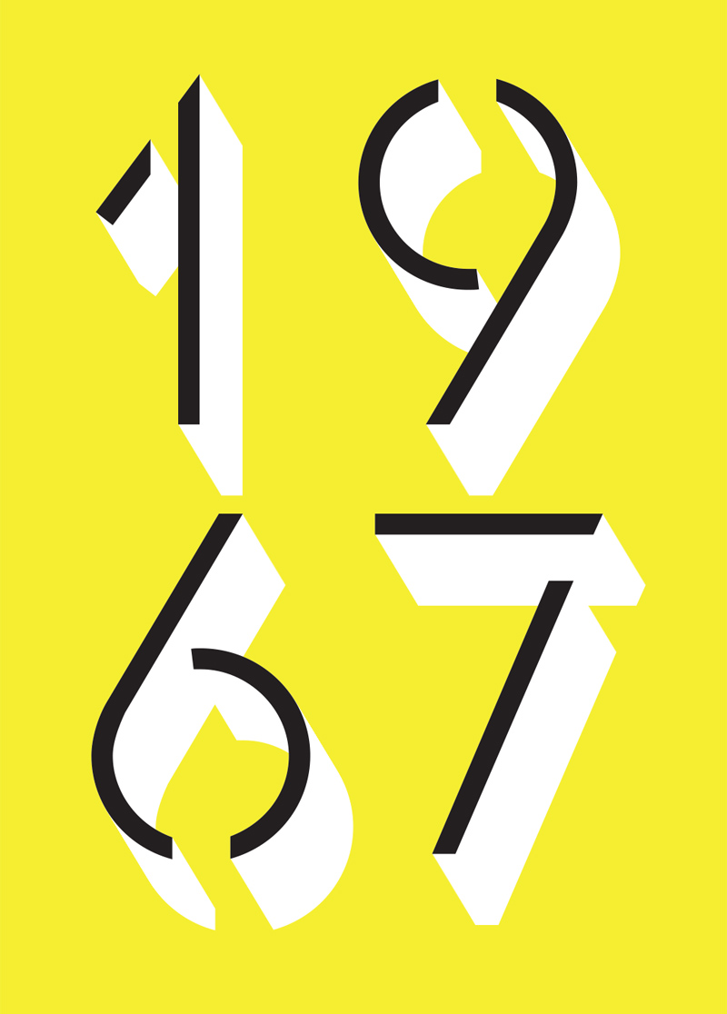
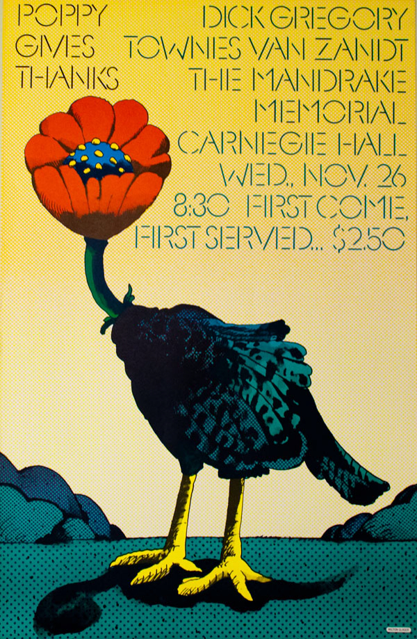
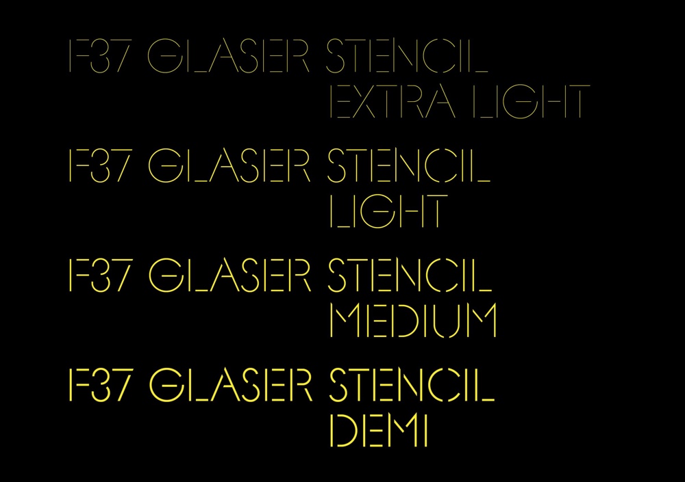
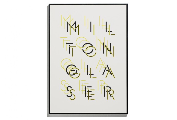
British designer Rick Banks, founder of Face37, based his new typeface F37 Glaser Stencil on this poster designed by Milton Glaser in 1967.
I’d be the last to deny that Glaser is a paragon of the design industry but some of his more flamboyant works, like this poster, leave me less thrilled than others. Nevertheless, F37 Glaser Stencil is a wonderful bit of historical revivalism. It looks fresh and vibrant and fully relevant; I hope it catches on and that we’ll see a lot of it soon.
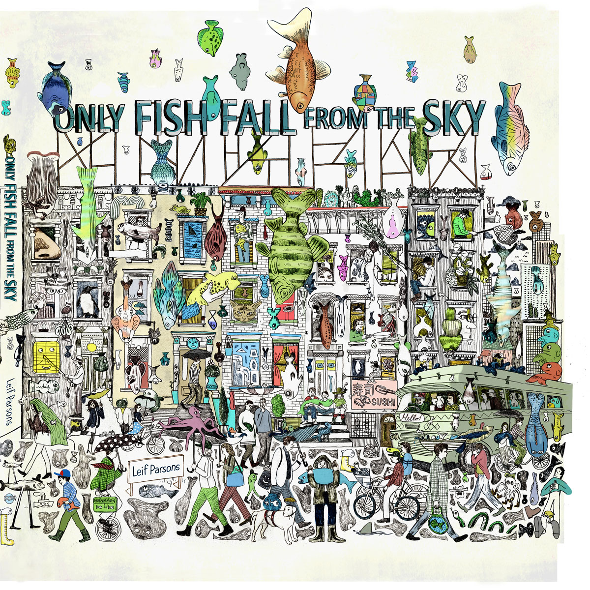
One of my favorite illustrators, Leif Parsons, has written and illustrated his first children’s book: “Only Fish Fall from the Sky.” The book is a fantastical dreamscape in which “a boy wakes from a marvelous dream to find the world is not quite as he left it; raindrops are falling from the sky, instead of fish, when everyone knows that only fish fall from the sky! Is he asleep or awake?” The pages are exquisitely, elaborately packed with unexpected details that kids (and adults) can pore over for hours.
Parsons is doing a book launch (with activities for kids) in Brooklyn on 17 May. The book is available for sale at Amazon.com.
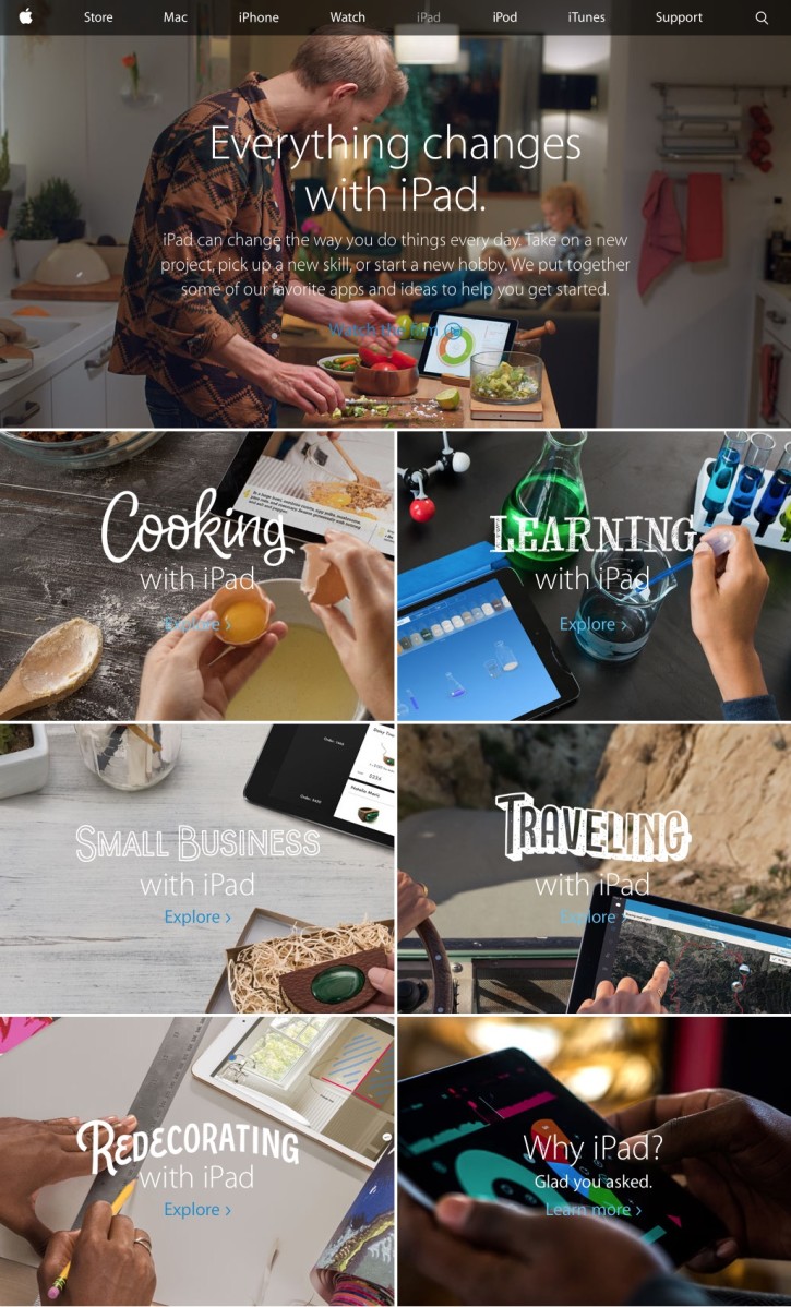
Last week I questioned whether Apple is a good steward for the iPad platform, but one thing seems clear: the Apple marketing team is working harder at differentiating the device than any other group in the company. In spite of what I would call relative indifference on the part of the software and hardware teams, Apple’s marketing has continually tried to make the case for the iPad in a series of fairly well executed if not particularly spectacular or very memorable ad campaigns. The newest is apparently based on the theme “Everything Changes with iPad,” and it features some of the most eclectic typography I can recall seeing at Apple.com:
The message is that “iPad does lots and lots of stuff,” and both the marketing site and the accompanying video (at the top of this post) go to great lengths to showcase a wide variety of those use cases and the many terrific apps that make them possible. The entire marketing effort seems geared towards answering the fundamental question that consumers have about the device, as tacitly acknowledged by the bottom right section of the site, which poses it simply: “Why iPad?”
It’s worth noting that even five years after its debut, the company is still grappling with this existential issue. That says a lot; you don’t see them trying to answer “Why iPhone?” It also worries me that their answer is so broad—none of the example apps shown here truly stand out apart from the others. It’s not that they’re bad apps; on the contrary, they’re very good apps. But as a group they’re so diverse that the campaign doesn’t seem to target a specific kind of user; it just seems to say that the product is supposedly good for everybody. As the old advertising saw goes, if something is for everyone, it’s really for no one.
Last week, along with a few of the folks from Adobe with whom I’ve been working on Adobe Comp CC, I visited a handful of design teams at companies here in New York City. The original inspiration for the meetings was to share some of the thinking that’s driving Adobe’s new creativity software (like Comp CC—really, you ought to check it out). But we also wanted to engage designers in conversations about the tools they’re using.
I’ve repeatedly stated my belief that this is a golden age for innovative new software and services geared towards the needs of working designers. What the Adobe team and I wanted to learn firsthand was how this change is being experienced by some of the best shops around town. Our mini-tour took us to a media company, a large design firm, a big tech company, and two boutique design studios. All of these teams do some flavor of high-end digital product design, both on the Web and for native apps. We also held a breakfast event at General Assembly that was open to the public and had a great turnout of designers.
When we sat down with these people we asked about what software they’re using and why, what’s working for them and what’s not, and what they’re excited about and what’s frustrating to them. Here’s a very unscientific overview of a few of the trends I noticed.
Bohemian Coding’s Sketch is emergent, but relatively few have switched. Based on the enormous buzz that the app has generated over the past few years, it was no surprise that awareness was very high among the designers we met. However, I didn’t expect to find that less than a quarter of them were actively using it. Most had tried it and had yet to fully switch or didn’t take to it all, and others felt that they “should” try it. That latter sentiment was particularly striking; for many, there was an air of inevitability about Sketch, as if they expect that at some undetermined point in the future they’d eventually switch.
Adobe Photoshop is still in wide use, though not without complaint. It’s not particularly shocking news that many people who have been using Photoshop for years and years have continued to do so. You could chalk this up to ingrained habits, but it’s also true that the tool is doing the job for them; most of these people also regard it as the most stable and versatile app for their needs. Of course, as the platforms they design for have changed, using Photoshop has entailed more and more friction, particularly around responsive design, and there was a real hunger for the application to take on new, product design-specific features and approaches.
Adobe Illustrator is surprisingly popular. It used to be rare, at least in my experience, to find digital designers who used Illustrator, but in one of the bigger surprise findings from our visits, we encountered a sizable contingent of folks for whom Illustrator is their tool of choice. This seems to be a function of the popularity of responsive design, for which Illustrator’s support for multiple artboards is well suited, and Retina screens, for which Illustrator’s vector-based tools are a natural fit.
Adobe After Effects is also unexpectedly popular as a tool for visualizing animation and transitions in the design of native apps. However, some people feel that it presents an unrealistic (i.e., not accurately representative of Web or native behavior) idea of how an animation will truly behave.
Prototyping is the Wild West. Every team we met with uses a variety of prototyping tools, whether Pixate, Marvel, InVision, Flinto or others. There seems to be little if any standardization; as new tools emerge and teams find that they offer new advantages, designers readily adopt them and set others aside. There’s a feeling that this space has lots of growth and evolution ahead of it.
Dropbox as design server. Nearly every team that we talked to shares their files and assets via Dropbox, sometimes alongside similar services like Box or Google Drive, which can be popular with other parts of their organization. It’s inarguable that Dropbox has made this aspect of workflows much easier than it used to be, but it also illustrates how primitive it remains. Team members traffic files amongst themselves via manual hacks like modifying file names (e.g., “layout-final-emily.psd”), moving files into select folders, or notifying one another via email or other messaging services. No version control software like Pixelapse or the late, lamented LayerVault has taken hold.
Speaking of messaging, Slack is quite popular and has been adopted by lots of teams. I’m a Slack user myself for both Wildcard and Kidpost, and I like it a lot, but I’m always mystified by people who claim that it’s life changing. That sentiment seems to be not uncommon, though, and there was lots of enthusiasm for it.
None of these revelations is exactly earth-shattering, but hearing them from real people where they work really opened my eyes to ideas and trends that I might have been aware of beforehand but didn’t pay much attention to. Chalk it up as another win for the power of getting out there and meeting real users. Overall, the visits confirmed to me that the landscape is significantly changing for how we designers do our work and what tools we use, but it seems clear that there’s room for a lot more innovation going forward.
If you have thoughts or comments on the tools and workflows your team is using that you’d like to share, please drop me a line via the form at the bottom of this post.