is a blog about design, technology and culture written by Khoi Vinh, and has been more or less continuously published since December 2000 in New York City. Khoi is currently Principal Designer at Adobe. Previously, Khoi was co-founder and CEO of Mixel (acquired in 2013), Design Director of The New York Times Online, and co-founder of the design studio Behavior, LLC. He is the author of “How They Got There: Interviews with Digital Designers About Their Careers”and “Ordering Disorder: Grid Principles for Web Design,” and was named one of Fast Company’s “fifty most influential designers in America.” Khoi lives in Crown Heights, Brooklyn with his wife and three children.
This is a twenty-three minute video that overlays every episode of season one of the TV series “Friends” directly on top of one another, resulting in a frighteningly shrill nightmare of sitcom inanities. It also happens to be sublimely lovely in parts, not to mention transfixing. You’re welcome!
When people ask if I’ve seen any good movies lately, I tend to answer that, with three kids and a surfeit of side projects, I hardly ever get to watch anything. But looking back at the past twelve months, I realize that somehow I did manage to see a decent number of the year’s more notable releases. So, at the risk of running a blog post that really should have been published in December deep in the middle of January, here are some thoughts on the films I watched in 2014, in no particular order.
“Life Itself”
It’s a real testament to Roger Ebert’s integrity—not just as a critic, but as a person—that he refused to let his documentarian make a whitewashed, shallow film of his life; what got captured and put on the screen is frank and unsparing and brave. It’s also a lovely reminder of how rewarding a deep, abiding love of film can be. One of the year’s best.
“The Grand Budapest Hotel”
Director Wes Anderson’s previous outing, “Moonrise Kingdom,” struck me as overly preoccupied with artifice (I wrote about it three years ago in this post), so I approached this movie with little enthusiasm. But thankfully Anderson found a renewed ability to paint singularly rich characters that actually make the precious worlds he constructs around them somewhat sensible. A terrific, winning performance by Ralph Fiennes helped make this film a delight, and I walked away quite pleased, even though I found it was overpraised on other year-end lists.
“Boyhood“
I wrote effusively about this movie after seeing it in theaters in this post. Months later, I still regard it as a cut above everything else released this year; no other film was as effective at rethinking what is possible in cinema, at redefining the idea of “movie magic.” An astounding achievement that, for me, cements director Richard Linklater’s position as one of the very best filmmakers of our time.
“The Lego Movie”
Far, far more entertaining than a movie based on a line of toy bricks has a right to be. Still, at the end of the day it’s a movie about a line of toy bricks, and for me it never quite transcended those origins. Fun to watch, but overhyped, in my opinion.
“Captain America: The Winter Soldier” and “Guardians of the Galaxy”
Both of these movies do more with their genre roots than one can reasonably expect, and I enjoyed them. And yet, I can’t help but feel that the entire run of Marvel’s recent successes is really just a systematic lowering of our expectations. Even at their best, they’re still a shadow of the films that they so clearly emulate—“Three Days of the Condor” and “Star Wars,” to name just two in these examples. I don’t mean to imply that comic book films as a whole are regressive, just these. They were good, but they could have been so much better.
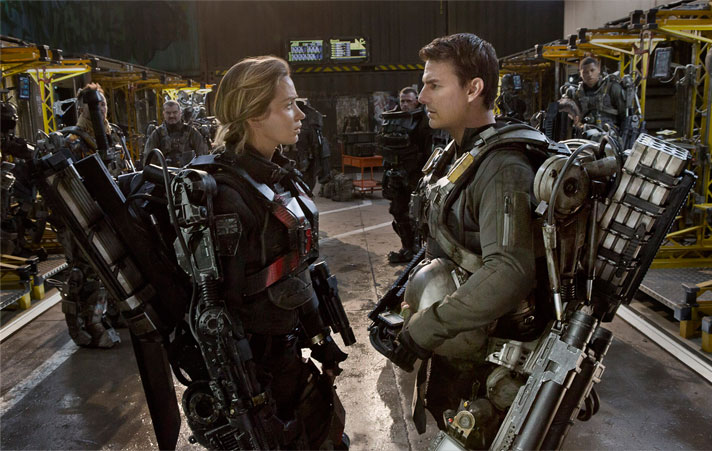
“Edge of Tomorrow”
It bewilders me how this movie ran aground at the box office while miserable trash like “Transformers: Age of Extinction” raked in the cash. “Edge of Tomorrow” is, if not original, then everything a popcorn film should be: vibrant, surprising and loads of fun. I’d recommend it to anyone.
“Locke”
This really small independent film has the whiff of gimmick all over it: Tom Hardy drives a car for eighty-five minutes and takes a bunch of calls on his speaker phone along the way. That’s it. And yet, “Locke” is surprisingly gripping and effective, a truly powerful demonstration of how few resources are truly needed in order to generate substantial drama.
“Dawn of the Planet of the Apes”
An astoundingly substantial entry in a decades-old franchise that has always danced on the edge of self-parody, if it didn’t frequently just trip right over into it. The nonsensically titled “Dawn…” somehow managed to make its premise not only believable but more deeply human than would seem possible in a film devoted to talking apes. I’ve approached every “Apes” sequel with dread, but after this one, I’m genuinely looking forward to the next one.
“Gone Girl”
I’ve been a David Fincher fan since his earliest films, but after watching “Gone Girl” I came to the realization that almost all of them, including this one, are gorgeously wrapped but deeply flawed. There’s always some absurd dramatic conceit that stretches credulity, some ridiculousness hidden just beneath the meticulously crafted surface. “Gone Girl” is cursed with this in spades, and I found it difficult to stomach, even notwithstanding Ben Affleck’s clumsy performance.
“Interstellar”
Speaking of ridiculousness, Christopher Nolan’s space travel epic is similarly plagued, but its sheer ambition more than compensates. “Interstellar” is flawed, but it’s so very good in so many ways that the flaws can be excused, at least for me. The movie is rife with filmmaking ideas that I had never seen before, spectacles in the very best sense of the word. It’s not clearly a masterpiece if it is at all, but it’s a truly amazing film nevertheless.
“A Walk Among the Tombstones”
Not to be mistaken with Liam Neeson’s other recent fare—no wolves are harmed and no vengeance is exacted in this surprisingly bookish, somber potboiler. It’s not a terribly consequential film, but in its quiet, small scale way it’s quite good—a grimy, unpretentious hard boiled mystery that holds the attention without resorting to spectacle.
“Big Hero 6”
The early reviews for this animated kiddie actioner were really, really encouraging, and I can see why. Its blend of antiseptic Disney charm and frantic Marvel super-heroics, underpinned with a decent degree of genuine heart, was engaging. But its story is so slight, and it rushes so quickly into pro forma explosions and fight sequences that its early promise is never really fulfilled.
“Birdman”
Logistically, this is a shockingly well-executed film. Everything really came together to make it work, from a wonderfully taut script to the brilliant casting of Michael Keaton in a role only he could play. That cohesion had me riveted throughout, even through the movie’s barrage of vindictive tirades against…well against seemingly everything that ever displeased director Alejandro González Iñárritu about the entertainment business. At its core it’s actually quite an incoherent film, and, as it focuses entirely on the bubble of the entertainment industry, it comes off as more than a little self-important.
“Under the Skin”
A bizarre, spooky, not quite sci-fi thriller that defies easy description, backed by one of the most hauntingly effective soundtrack that I heard all year, courtesy of composer Mica Levi. This is director Jonathan Glazer most successful attempt yet to fuse contemporary fine art with the conventions of genre films; the result is vivid and unforgettable.
“Snowpiercer”
A load of over-the-top digressions knitted together into a semi-coherent whole, this bonkers movie about a dystopian future where the remnants of humanity are confined to a train that never stops running is ridiculous fun for a while. But it never manages to reconcile all of its crazy ideas, and sputters to a disappointing finish.
“X-men: Days of Future Past”
It was fine, I guess, with a few impressive scenes scattered throughout. But like its Marvel-produced cousins, it does better when measured against other comic book fare than against the broader context of more ambitious films. In the end, I found it to be flatly inessential.
“Jodorosky’s Dune”
A delightful, heartbreaking documentary about a wildly ambitious adaptation of Frank Herbert’s “Dune” novel that never came to be. The story of its abortive development is packed with amazing anecdotes and wonderful work that never made it to theaters, but the real treat is all the time viewers get to spend with the highly spirited, deeply inspiring Alejandro Jodorosky, one of those rare filmmakers who underestimate neither their audiences nor the power of film. Highly recommended.
Of course, there were plenty of films from 2014 that I actually didn’t get to go see, and that I still hope to. Here is a shortlist.
“Global digital product studio” Ustwo (creator of the critically lauded “Monument Valley” game) got a plum assignment from Google: design a series of digital watch faces for Android Wear. They documented their experience in this video, which I watched a few times, as I’m eager to learn more about wearable technology and the challenges of designing for it. With each viewing I felt a frustration that I couldn’t quite put my finger on, but then I realized that there are almost no specifics divulged throughout the video’s 3:52 running time.
There are a lot of blank platitudes about “redefining time” and wearable technology as a new frontier (a producer claims that “Where we can go with the design and development on this platform is unlimited”), and some fleeting images of the watch faces that resulted. The studio produced about twenty designs, ranging from basic time-telling watch faces to those that integrate with data from Android phones, and you can see them at wear.ustwo.com, but little is offered about the design process, the unique challenges that they encountered, or more importantly, why these watch face designs are useful or special or even necessary. For instance, the description for one of the faces reads like so:
Who doesn’t like dominos? Now you get to watch them topple over. Forever.
Great.
It’s early yet for wearables and smart watches in particular, but I’m getting the feeling that there may be no there there. Which is to say, it’s hard not to notice a distinct lack of interesting ideas driving what we’ve seen so far. Even the watch faces that Ustwo describes as “smart” seem only nominally innovative: one represents how busy you are through visual blobs, another shows the weather, another tells you how long until your next appointment, etc. There’s nothing that seems imperative or enlightening, though to be fair the studio’s brief may have been watch faces explicitly, and the real innovation may come with more fully fledged watch apps.
One more note: it’s hard for me not to notice that Ustwo claims 198 employees across offices in New York, London and Malmö—and yet apparently they were unable to find any women to work on this project, or at least to appear on camera in this video.
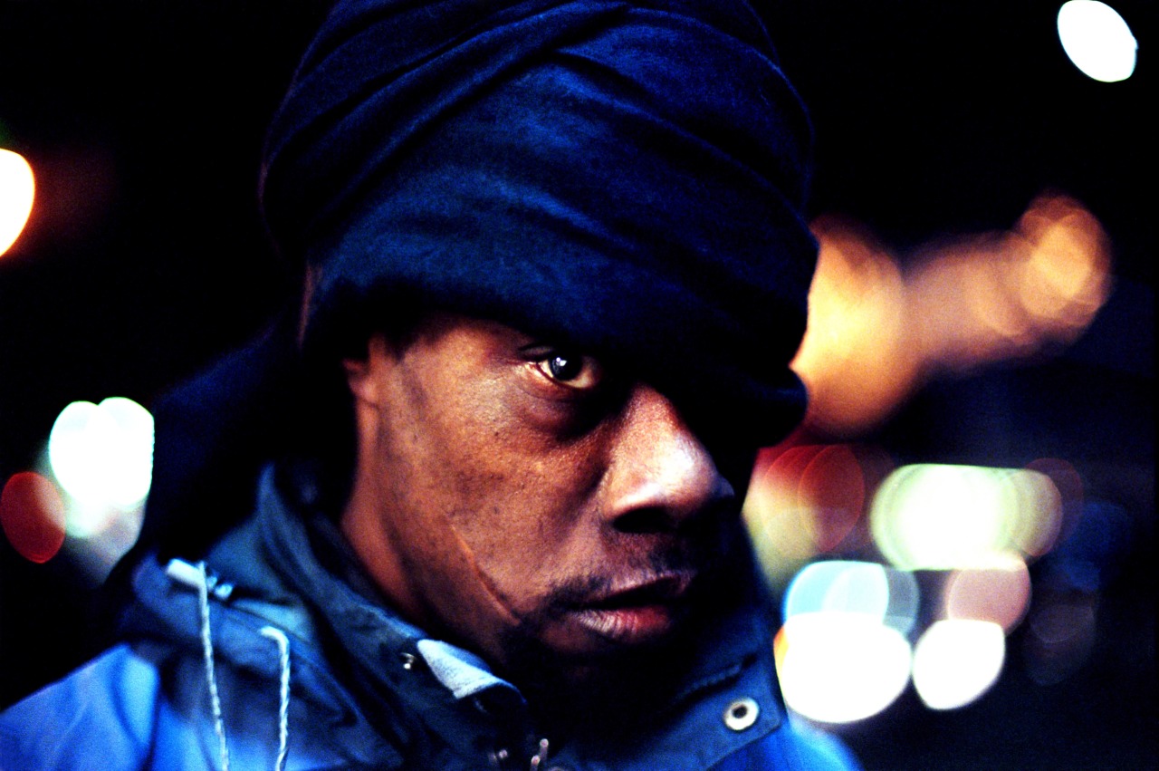
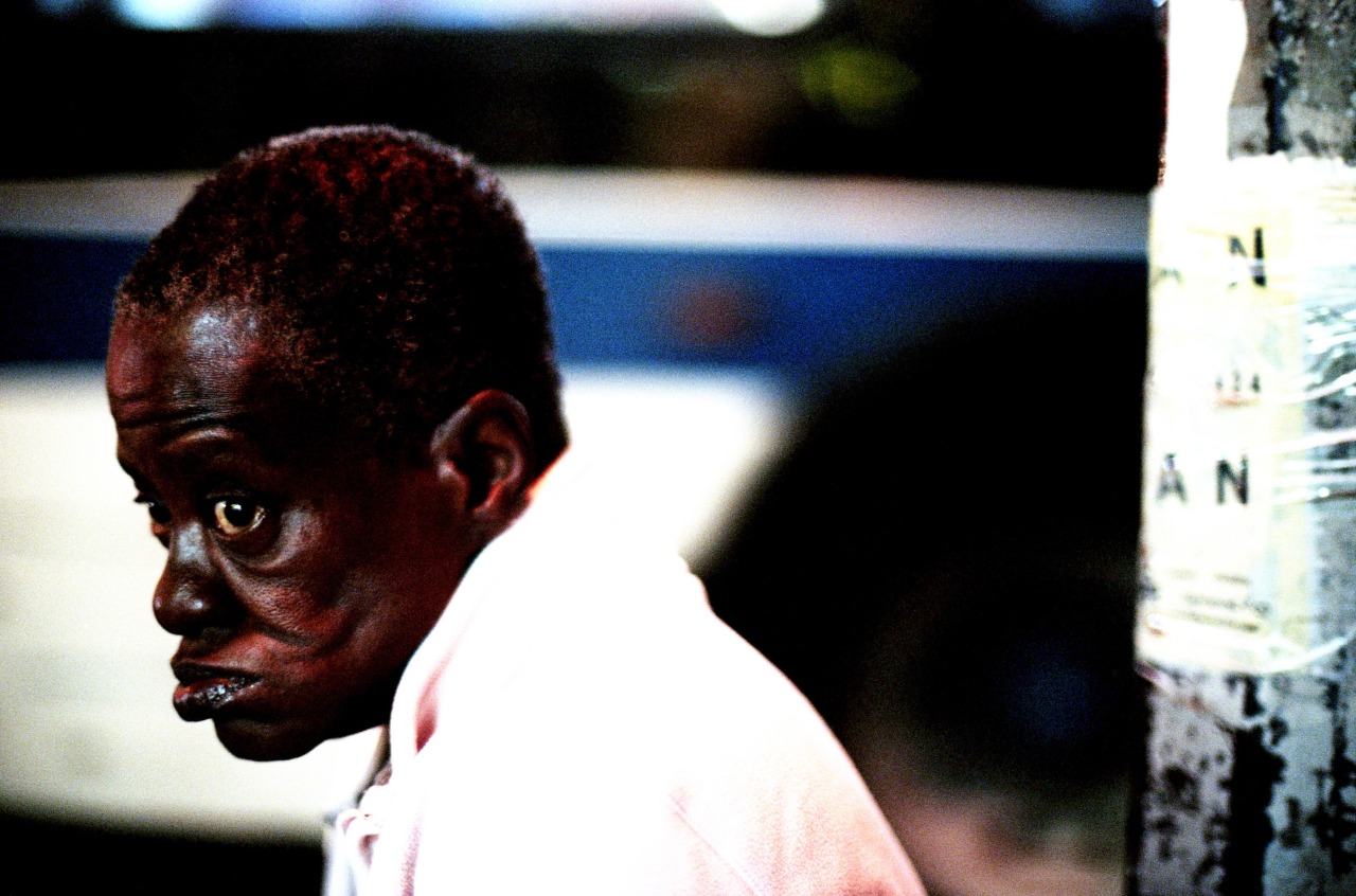
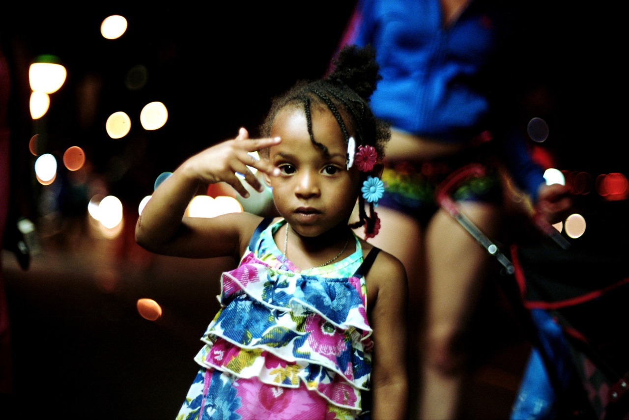
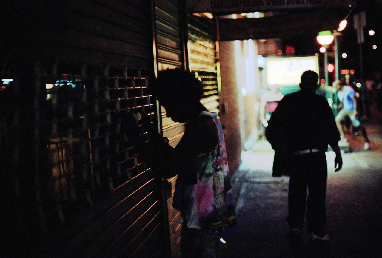
Photographer and filmmaker Khalik Allah has taken beautiful, vibrant photographs of the people of Harlem, NY, focusing recently on the corner of 125th St and Lexington Avenue. His portraits are deeply engrossing and capture street life with rare verve. He also directed a 60-minute film called “Field Niggas” that’s available in its entirety on Vimeo.
Almost everything you see at Wildcard was designed by my colleague Stephen Meszaros and myself, but we want to change that. As of today, we’re officially looking to add a third member to our small design team. You can see the listing and job description at Authentic Jobs, where you can also apply.
People often ask why I joined Wildcard, where I’m an employee and not a founder, after having founded a few companies of my own. There are lots of reasons, including some very good ones for those who like substantial design challenges in an engineering-rich but design-savvy company culture. But the best reason is that the co-founders at Wildcard have put a premium on hiring good people—not just talented people, of which there are a lot, but also genuine people. As a result, working at Wildcard is not only professionally rewarding, but also highly enjoyable. It’s a wonderful team. We’re looking for the right new designer to join it.
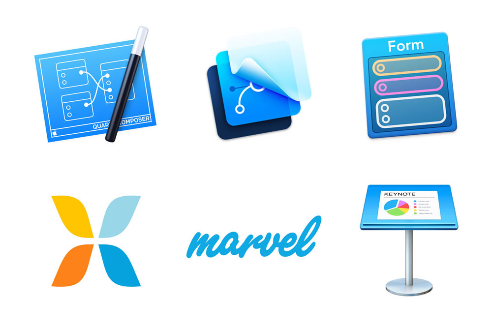
Over the past year-plus of designing, building, launching and iterating Wildcard, we’ve used a slew of tools to prototype the kinds of interactions that have gone into our iPhone app. My colleague Steve Meszaros just published a terrific post at his blog with his perspective on each of the major ones that we’ve used. Those include:
Quartz Composer
Form
Pixate
Adobe After Effects
Marvel
Keynote
Framer.js
“What tools do you use for prototyping?” is one of the questions that I hear app designers ask one another most frequently, and this extensive write-up is one of the best answers that I’ve seen. Read it in full at stephenmeszaros.com.
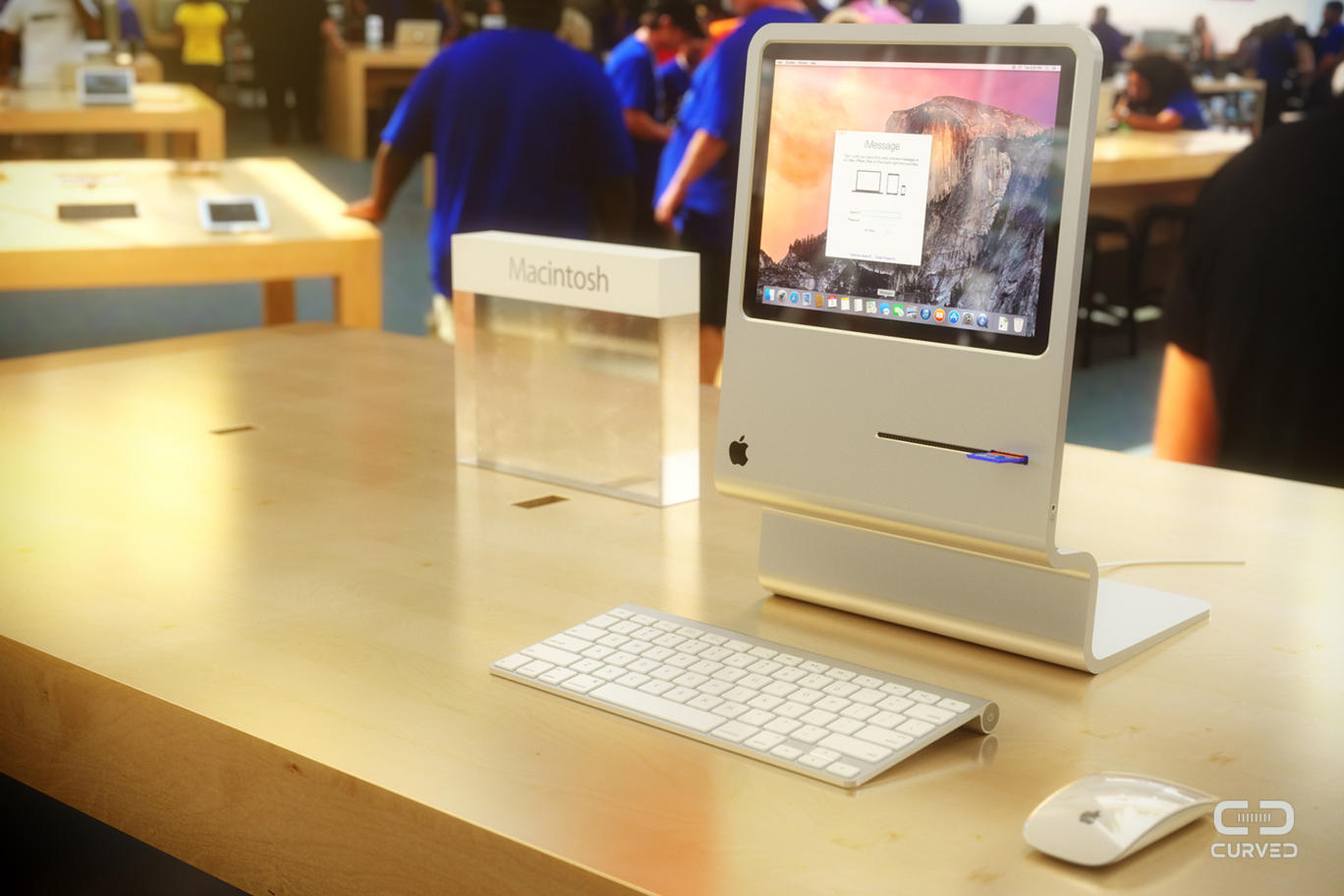
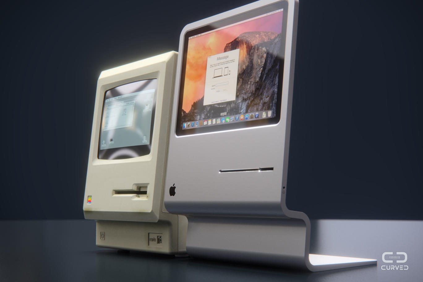
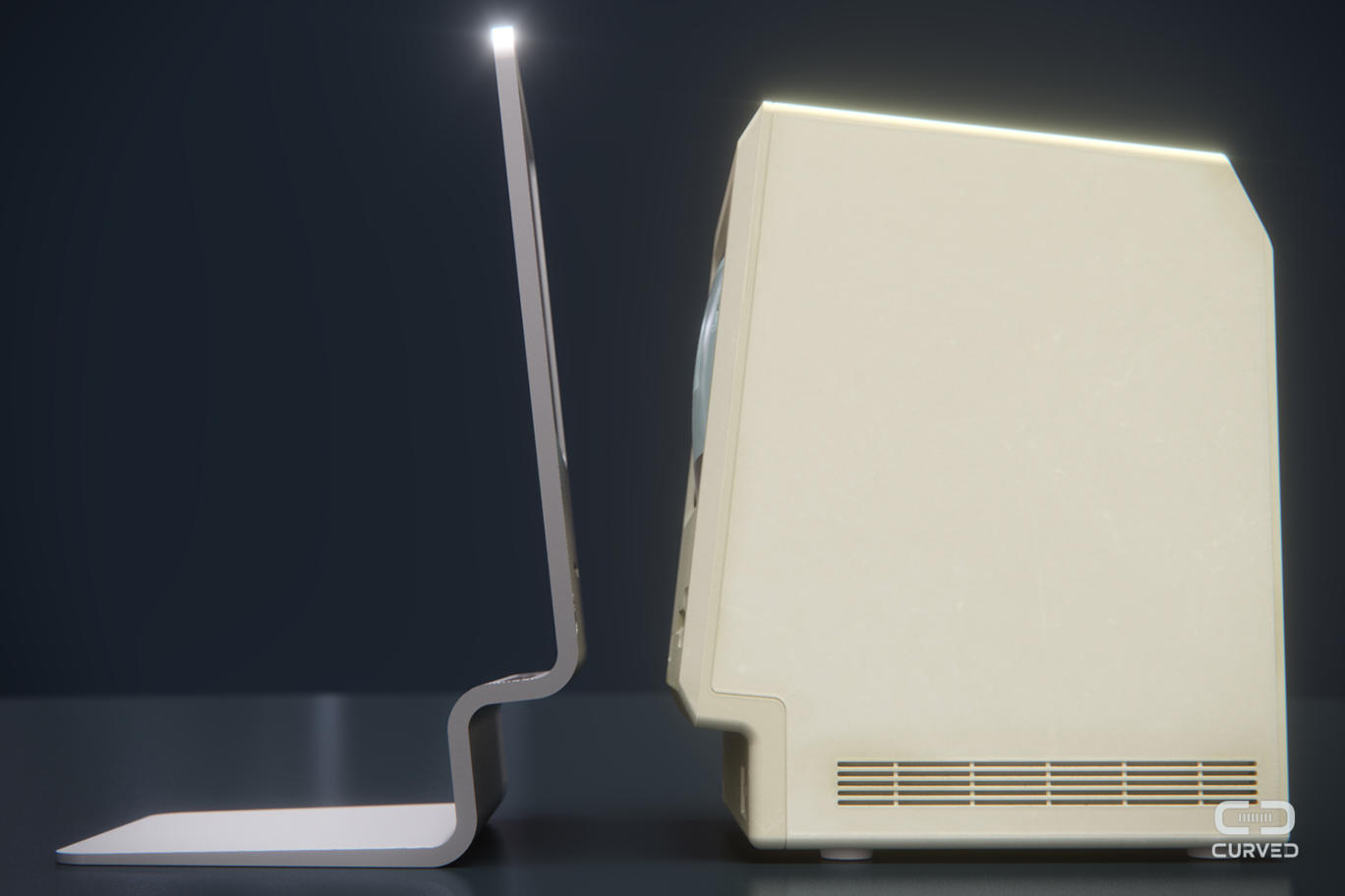
This concept design from Curved Labs pays tribute to the original 1984 Macintosh design by reconfiguring a MacBook Air into a novel, beautiful new form factor. From the front, it looks very much like its antecedent, but from the side it’s more reminiscent Hitchcock’s portrait—it suggests the mass of the thing it represents by merely tracing its profile. There’s an SD card slot where the old floppy disk slot sat, and on the back you can find USB 3.0 and Lightning ports. A FaceTime camera is included as well.
I particularly like the way these product photos are shot with a gauzy, full-color sheen and dark background that’s very reminiscent of similar commercial photography from the 1980s. That’s follow-through.
Owning an iPad has made me a more frequent reader of comic books than I have been at any point since I was a kid. I don’t write a lot about the ones I read here because I find that few people who don’t already read comics are willing to give them a try—despite all of the form’s cultural progress over the past several years, the idea of actually reading a comic book is still too loaded with juvenile connotations for most folks. On occasion, when I come across something really outstanding, I’ll make an exception, like I did with Darwyn Cooke’s stunning adaptations of Richard Stark’s “Parker” novels—but that post was greeted with mostly crickets.
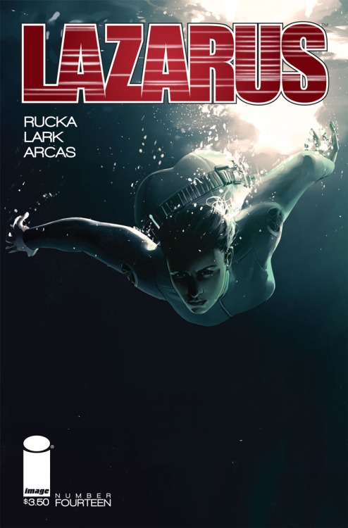
Nevertheless, I feel compelled to mention Greg Rucka and Michael Lark’s “Lazarus” series, the fourteenth issue of which debuts today. Its genre is near-future, dystopian science fiction, set in a world where some kind of economic collapse has resulted in the planet being carved up into territories owned by feudal families. That premise might sound familiar, but it’s an astonishingly vivid vision, masterfully crafted and narrated by Rucka, who is one of comics’ very best writers, and rendered with bracing naturalism by the amazing drafting hand of artist Michael Lark. I was skeptical about the book at first, admittedly in part because the series logo is not particularly impressive. But I’d read Rucka and Lark’s work on “Gotham Central” series some years ago and found that to be truly superb. “Lazarus” is even better.
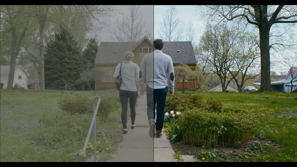
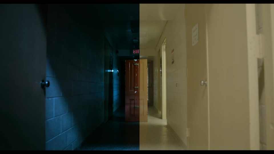
This remarkable video demonstrates the material impact of the color grading process in digital film making. It shows footage from the 2014 horror film “The House on Pine Street” before, during and after it’s been manipulated. The original picture quality is surprisingly bland and tonally even, lacking in dramatic contrasts. Here’s one example.
Color grading usually adds an expected amount of drama to the picture, but in some cases, it can substantially alter the meaning of what was captured by the camera. In this example, a normally lit hallway becomes shrouded in shadows and portent:
Though few people believe that what gets projected in modern films is “reality,” this demonstration is a powerful reminder that what we perceive to be merely embellishment can actually be a full-scale distortion.
Update: Director Jeffrey Zablotny, a director, wrote in with some clarifications on this process:
The ‘original picture quality’ that appears bland and tonally even—that’s not really representative of what’s captured by the camera; it’s just the most neutral possible picture to show all data available to the colourist. (It’s the equivalent of a RAW file.) There’s actually a tremendous amount of contrast and shape already built into that captured image by the cinematographer on set, and typically his or her intention is carried out and subtly enhanced by the colourist. It’s tempting to conclude that digital colour grading is the magic wand that truly brings the image to life, but it’s actually the last step of a long creative chain that begins before shooting even starts.
The versions of the shots you’re seeing fly by aren’t finished potential iterations, but more like important milestones as the grade progresses —hopefully, the cinematographer’s intent is the always final one. There’s an initial pass or two for overall balance and temperature (often called primary colour correction), secondary passes for subtler tonal values (subtly making things greener, bluer, etc), and then final cosmetic passes for vignetting, and special details. This video chooses not to address the wonderful world of keying and windows, which allow extremely particular details of the image (just one face, or whites of the eyes, or perhaps a certain specific shade of red in a lamp somewhere) to be isolated and tracked. Incredible technology.


