is a blog about design, technology and culture written by Khoi Vinh, and has been more or less continuously published since December 2000 in New York City. Khoi is currently Principal Designer at Adobe. Previously, Khoi was co-founder and CEO of Mixel (acquired in 2013), Design Director of The New York Times Online, and co-founder of the design studio Behavior, LLC. He is the author of “How They Got There: Interviews with Digital Designers About Their Careers”and “Ordering Disorder: Grid Principles for Web Design,” and was named one of Fast Company’s “fifty most influential designers in America.” Khoi lives in Crown Heights, Brooklyn with his wife and three children.
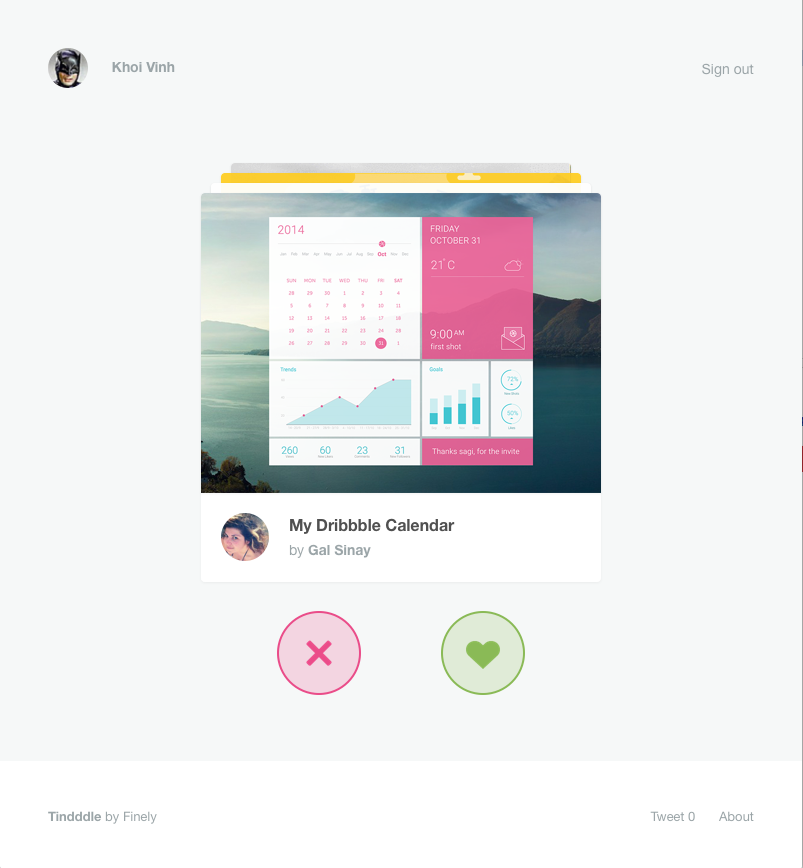
Tindddle is a fun mashup of a Tinder-style approval and rejection interface and Dribbble shots. Swipe or arrow key left or right to indicate your rejection or approval, respectively, of each piece of work. I enjoyed quickly running through a few dozen samples in no time, though as with all of these interfaces, I often inadvertently rejected cards that I intended to approve and vice versa.
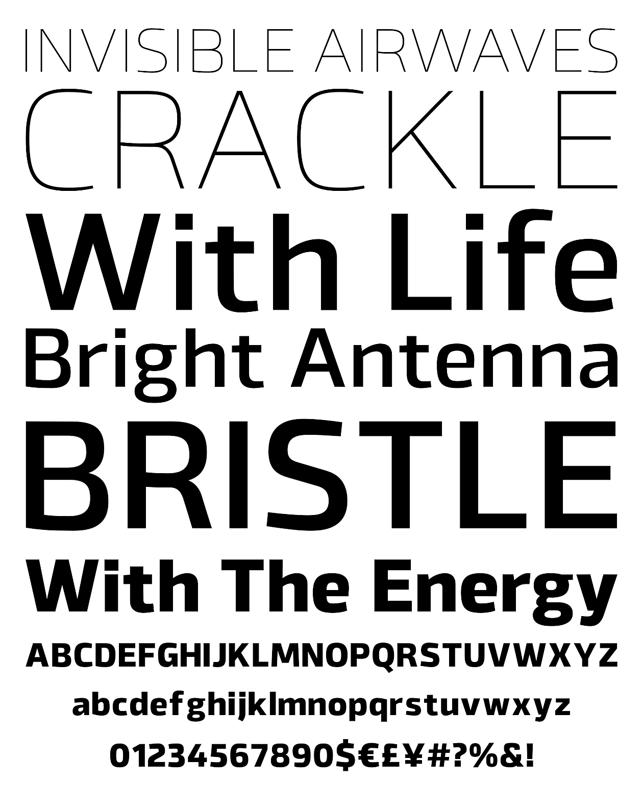
The Northern Block’s Byker typeface is a handsome geometric sans serif that, as the name suggests, is meant to evoke the high-end tooling of performance bicycles. Its designer, Jonathan Hill, says:
The letterforms are constructed digitally from a technical grid and overlaid with handmade curves. The combination of this process creates a strong, organic font that is precise with subtle movement and personality without being too clinical.
YouWorkForThem has the entire type family on sale right now for just US$23.50 for the desktop version (a webfont license is also available for the same price). Byker comes in fourteen fonts, from Ultralight all the way through Extra Bold and Black; that kind of versatility for that price is a steal.
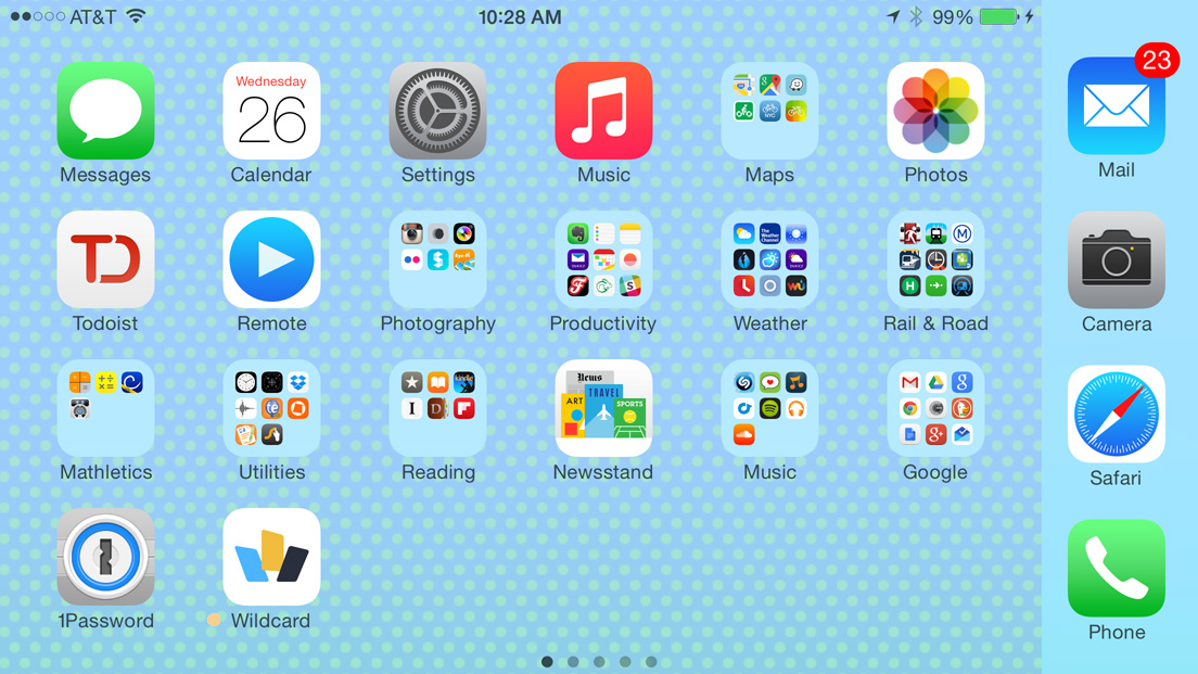
Betaworks has a new, simple app called #Homescreen that lets you share screengrabs of your phone’s homescreen. The ostensible purpose of the app is to satisfy broad curiosity about what people put on the default screen of their phones, but Betaworks is actually doing this to better understand the broader trends behind this very personal customization activity that neither Apple nor Google provide insight into.
Once uploaded, the screens can be seen at the domain homescreen.is, and behind the scenes Betaworks is analyzing them for patterns. CEO John Borthwick wrote about this in this Medium post, and you can see Betaworks’ dynamically generated homescreen of the top apps here. My contribution is located here, though the site doesn’t seem to know what to do with the frankly ridiculous scale of my iPhone 6 Plus. So I thought I’d share it here on my blog where, thanks again to the 6 Plus’s unique landscape mode, it fits nicely inline with this text.
#Homescreen reminds me that for a long time I’ve thought that there’s a very interesting app to be made from mobile screen shots—an app that could produce a powerful design reference that we don’t have today. What I have in mind is a mobile app that lets you take screen shots of not just your homescreen but of any app. By uploading those screengrabs, you’re effectively building an index of user interface designs, documenting how these apps that we use constantly are changing.
This would be a kind of Archive.org for mobile, and though we have some enterprising projects that are similar (like UX Archive), with the right social incentives in place, we could have countless people documenting countless apps daily. This would give us visibility into a kind of evolution that has become more difficult to observe and document now that both major mobile platforms install updates automatically. What a fantastic resource that could be for understanding the arc of our craft, giving us a new understanding of the life cycle of the design of digital products. #Homescreen is not trying to be that, but its basic infrastructure wouldn’t be too difficult to emulate and adapt, theoretically. Anyone?
After several months of development, Kidpost is finally live and out of beta today! For those new to it, Kidpost is a simple service for parents that pulls pictures of your kids from social networks, bundles them into a nifty daily email, and sends that email along to friends and families. It’s the easiest way to “keep your loved ones up to date on your little ones,” as our tagline goes. Find out more at Kidpost.net.
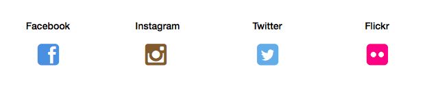
Our launch version now includes a few extras that were not there when we rolled out the public beta back in June, including support for two new services: Kidpost can now pull from Twitter and Flickr, as well as Facebook and Instagram.
Additionally, if you don’t want to use our standard hashtag “#kidpost,” you can now set your own hashtag, e.g., “#smithfamily” or anything you like. We built this to give folks more control and privacy.
With our official launch, we’re also rolling out subscriptions. Here’s how they work: new users get sixty days to try Kidpost free, so if you sign up now, you can play with it through the holidays, and you don’t have to decide whether you like it enough to keep using it or not until early next year. There’s no credit card required to get started, so go give Kidpost a try right now.
If you do decide that you like it, you can subscribe to Kidpost for just US$3 per month or US$30 per year—ridiculously cheap, in other words. We worked hard to keep the price point at that “no brainer” level. An annual subscription works out to be incredibly competitive with most online services out there.
(Beta testers get a special discount—and if you signed up for Kidpost before yesterday, then you qualify as a beta tester. Look for an email from us with more information.)
Also, just as before, Kidpost is always free for your friends and family—and you can now designate as many as 100 of them to receive your Kidpost email digests.
Finally, getting to launch is particularly sweet for me not only because of all the hard work that Matt and I put into it, but also because it’s our first opportunity to announce that we’ve been joined by my friend and former co-founder at Mixel, Scott Ostler. Scott came aboard late in the summer when our previous partner, Mike, had to leave the project due to time constraints. Mike did such a fantastic job that we were worried we wouldn’t be able to replace him, but luckily Scott was in a position to take over. We’ve been working nights and weekends to get Kidpost done ever since, and it feels so rewarding to start building stuff with Scott again after the lamented wind-down of Mixel. If you’re interested, I wrote about how Mixel directly influenced Kidpost back in June in “this post.”
We’ve been using Kidpost ourselves, with our friends and families, for months, and it’s been a big hit with our loved ones. If you’re the parent of a young child, and you have friends and family who are having trouble keeping up with the pictures you post to social media, I urge you to give it a try.
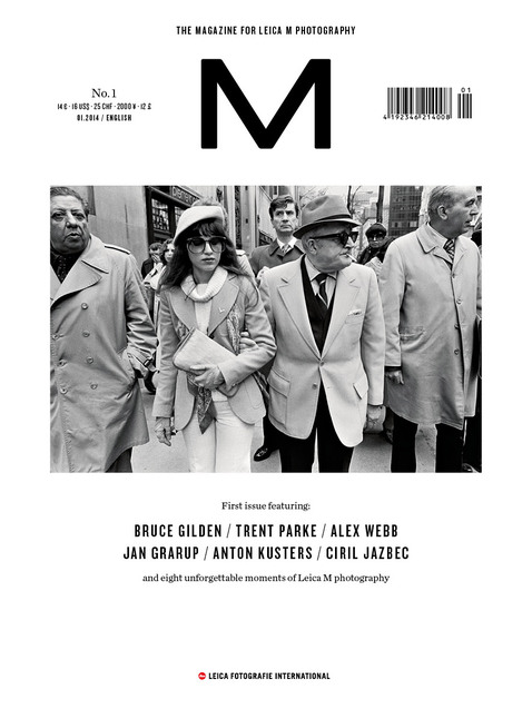
M Magazine is a new print and digital publication dedicated exclusively to the photographs taken with the Leica M series of rangefinder cameras.
Whether the civil war in Central Africa or the problem districts of Caracas—countless stories are being told with the Leica M system. The LFI loan pool also contributes towards this: Leica cameras are being lent continuously to photographers around the world, so that they can produce very special stories. Discover the world of Leica M photography with exciting reportages and haunting picture series, news, films and the complete M Magazine.
The starkness of the first issue’s cover is wonderful.
Also note the domain for the magazine’s Web site: m-magazine.photography. That’s the first of its kind that I’ve seen.
This fall I upgraded to a new iPad and a new iPhone, both with cell service from AT&T. We have five lines on our AT&T family account, so I am effectively locked into AT&T until I find the time and energy to switch to an alternative carrier. This means I’m more or less helpless when AT&T pulls their usual customer-unfriendly shenanigans, which lately seem to revolve around SIM cards.
It was somewhat well publicized that the iPad Air 2 comes with a potentially game-changing Apple SIM, which lets customers choose carriers and potentially even switch between them on the fly. AT&T, in that special way that they have, decided to effectively thwart that feature by locking the Apple SIM to its network as soon as a customer activates the iPad on AT&T. The company’s only explanation for this was, “it’s just simply the way we’ve chosen to do it.” That’s about as close as an executive can come to flipping the bird to customers as decorum allows.
Not being able to switch carriers without physically swapping in a new SIM card is an inconvenience, but I didn’t have the energy to fight AT&T on it, so I decided to go ahead and add the device to my account anyway. It’s possible to do that from the iPad itself, in the Settings app, but it didn’t work for me, so I had to call AT&T, who had no idea what an Apple SIM was, claimed it wouldn’t work on their network at all, and told me my only choices were to either restore my iPad to factory settings (I had already set it up with my apps and data) and/or go to my local AT&T shop to procure a standard AT&T SIM card. I argued with the representative on the phone but got nowhere, and, because it was late on a Friday night, decided to go to sleep with the issue unresolved. The next day I tried my luck by calling AT&T again, and managed to get a hold of a different representative who was a bit more clued in, though he still had to do some significant fumbling around to finally get it activated. Sigh.
Next device: my new, unlocked iPhone 6 Plus arrived last week. Since this one uses a standard SIM, I figured I could just use the SIM from my old, unlocked iPhone 5—simple enough, right? No such luck, as when I chatted with AT&T they refused to activate it over the phone, again demanding that I stop by an AT&T shop in person. Luckily, there’s a shop a few blocks away from my office, so I ran over there to get a new SIM, only to be told by a shrugging representative at the store that there’s no difference in SIM cards, and that I should have been able to just use my old one. Groan. He activated a new SIM card for me anyway and I was using it right away with no problems.
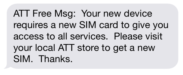
Then over this past weekend I got this text message:
I happened to be walking by an AT&T store this morning on the way in to work, so I figured I’d stop in and see about the message. Sure enough, the representative there told me, “Oh you can just disregard that,” and sent me on my way, with no changes.
Lots of folks will recommend that I move over to T-Mobile, and I’m tempted to do so, though a friend of mine told me that when he moved his family lines over, T-Mobile inadvertently canceled one of them. Attitude counts for a lot, though, and it seems at least that T-Mobile is proactively courting its customers, whereas AT&T seems content to kick us around. When I think of the amount of time I’ve wasted dealing with AT&T this year—not just with these incidents, but with a few others earlier in the year—it makes me sad. Life’s too short for this.
Having just gone through the exercise of finding the right music to accompany a product video for Wildcard, I’m terribly jealous of Big Spaceship’s production for this video for the Samsung Galaxy Note 4. It features the amazing Reggie Watts, and it’s like no other.
Thanks to everyone for the terrific reception and constructive feedback to Wildcard’s launch last week. As we start plowing ahead towards its next stage, I wanted to jot down a few thoughts about the app’s design.
Team and Process
Wildcard is roughly twenty-five people strong at the moment, and for the past year we’ve had a two-person design team: Steve Meszaros and myself. Between the two of us, we designed the entirety of the app and our Web site, with help from a freelance designer who’s been doing a bang-up job on our developer documentation.
As a company, we imposed some lightweight structure and scheduling to guide the development of the product, but by and large there were very few formalities. We held relatively few meetings, used a minimum of jargon, and had lots of spontaneous discussion. That is really the sweet spot for product development, if you ask me. When designers and engineers can engage in a healthy, iterative dialog, and when everyone feels united towards the same goal, then job satisfaction skyrockets and great things can happen. I’ve worked in environments where there was lots of process or bureaucracy, or where the teams were subdivided into a kind of sprawl and everyone is thrown into opposition with one another as a byproduct of nonsensical org charts. Exactly the opposite was true for us at Wildcard.
Tools
We started designing Wildcard at just the right time to eschew Photoshop as our main interface design tool and instead use Bohemian Coding’s Sketch. I started the first design files for Wildcard last October, at a time when Sketch was really hitting its stride. For the most part, the app worked beautifully, though as a still young product there were minor hiccups here and there. For instance, as the number of design files and screens we were designing grew, we started to push up against the limits of Sketch’s symbols and styles features. There were also one or two times when TimeMachine backups came in really handy after a file had been corrupted.
The design work we did in Sketch formed the basis for literally dozens of prototypes, some animated and some interactive. We were aggressive about trying lots of different authoring tools including Pixate, Origami, Adobe Edge, Keynote, Form.app, After Effects, and Marvel. Steve wrote about this a bit in this blog post, and if you’re interested in that topic it’s a great resource.
Type
Early on, we settled on Chester Jenkins’s superb Galaxie Polaris as our base UI and branding typeface. It was surprising to us to find how relatively little used Polaris is in digital products, as it seems to strike a very pleasing balance between legibility and distinctiveness. It’s not a typeface that screams for attention, and yet it establishes a very unique, contemporary flavor that suited Wildcard well.
Our original intention was to use the Polaris family exclusively throughout the app, but earlier this summer, as we started to integrate more and more written content into Wildcard, we quickly realized that we’d need a different typeface, a serif typeface, for larger blocks of text. Finding the right one was surprisingly hard.
We needed something that would be a harmonious complement to Galaxie Polaris and come in a wide variety of weights and styles and that was available for app licensing at a reasonable cost. The last criteria, particularly, made things much more difficult than we expected and it took us several weeks of research, trial and error to figure it out. Ultimately we settled on Kris Sowersby’s beautifully toned Tiempos. There are eight styles of Tiempos, all of which would come in very handy, but unfortunately only four of them are currently available for app licensing. This was a big disappointment and nearly a deal breaker for us, but in the end Tiempos is such a winning complement to Polaris, and so appropriate for our intended use, that we decided we could make do with those few styles in the short term.
Branding
Every bit of Wildcard was designed in house, including the logo. In case you missed it, I wrote some thoughts about that in this blog post earlier in the year.
Card Properties
Cards are easy to recognize but somewhat difficult to define, and so we spent the first several months trying to work through a host of questions about how our vision of cards should behave, e.g., What physics should a card possess? Should cards be swipable, stackable and flippable, as some recent expressions of the form (e.g., Tinder) have made popular? Should each card act as its own UI window, with its own navigational stack and affordances? How should a stream of cards relate to common navigation, particularly the Back button?
What we ultimately settled on was a straightforward, fairly unassuming articulation of what cards can do—you can scroll them and tap on them, and there are a few other less well promoted properties built in, but beyond that, our cards are not exactly jumping off the screen. That just struck us as the most effective way to establish a baseline for a product that already introduces plenty of unfamiliar ideas to users. But the properties that our cards have today aren’t necessarily the only properties that we expect them to have down the road. We have lots of additional ideas for how cards should behave, and we’ll be implementing them as the right opportunities emerge.
Card Types
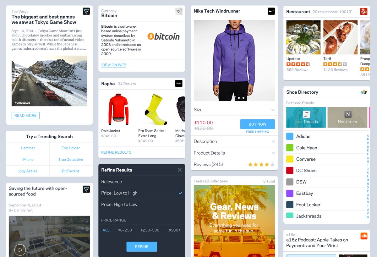
Wildcard is a browser for cards, but for now anyway, we can only display the types of cards that we’ve built support for. A few of those include: article card, product detail card, product search results card, directory card, video card, sound clip card, fact (Wikipedia) card, a card that represents a collection of cards, and several more. I’ve created a montage of a few of them at the top of this post.
Each card is a result of figuring out what’s feasible through data collection and indexing at scale—what common characteristics can be found in a vast majority of email newsletter sign-up forms, for instance, and how can we represent that in a consistent way that works with countless brands? From a user experience perspective, it’s a bit like templating large swaths of the Internet at once, which is an intimidating, humbling exercise. We think we’re just at the start of the learning curve on how to do this properly, and we have a long way to go to get really good at it. Rolling out a continual stream of additional card types is critical for us though, so expect to see new ones regularly. Each card type we introduce will affect the overall character of the app, and gradually even the ones you see in the app today will change, not just in what they look like but also how they behave and what our approach is to them. There are lots of unknowns ahead, but that’s why this is so exciting. We’re at the beginning of a long campaign to build a new kind of mobile web experience.
Douglas Adams, in his book “The Salmon of Doubt,” wrote that “I’ve come up with a set of rules that describe our reactions to technologies.” The rules are:
Anything that is in the world when you’re born is normal and ordinary and is just a natural part of the way the world works.
Anything that’s invented between when you’re fifteen and thirty-five is new and exciting and revolutionary and you can probably get a career in it.
Anything invented after you’re thirty-five is against the natural order of things.
I’m as guilty of this as anyone, I must admit. Youngsters: it will happen to you, too. Via cdixon.org.