is a blog about design, technology and culture written by Khoi Vinh, and has been more or less continuously published since December 2000 in New York City. Khoi is currently Principal Designer at Adobe. Previously, Khoi was co-founder and CEO of Mixel (acquired in 2013), Design Director of The New York Times Online, and co-founder of the design studio Behavior, LLC. He is the author of “How They Got There: Interviews with Digital Designers About Their Careers”and “Ordering Disorder: Grid Principles for Web Design,” and was named one of Fast Company’s “fifty most influential designers in America.” Khoi lives in Crown Heights, Brooklyn with his wife and three children.
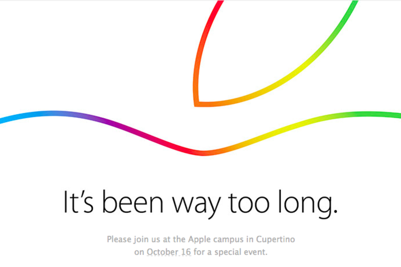
The headline for Apple’s media event tomorrow is “It’s been way too long.” That could mean anything, but what I most want it to mean is that the company will unveil a new Apple TV tomorrow. I don’t see how Apple could use that headline and not address that device.
It really has been way very long time since the company updated the Apple TV. The last revision was in late January of 2013, almost twenty-one months ago, or an eternity in tech product cycles. It’s been an especially long time when you consider CEO Tim Cook’s admission that, having done over US$1 billion in business last year, the Apple TV is no longer a hobby but a real business. We’ve been waiting for the fulfillment of this product’s potential for so long that Apple even had time to cook up an entirely new product category in the form of the Apple Watch—I’m not sure how many people were clamoring for the Apple Watch, but I can’t imagine it was as many people as have been clamoring for a new Apple TV.
According to The Verge, this is tomorrow’s announcement slate. There’s nothing about the Apple TV on deck here. If this proves accurate, that almost assuredly means that any new Apple TV would miss this year’s holiday season. Going yet another year without a meaningful upgrade to this product line would make me really wonder if Apple is indeed treating the Apple TV as a real business, and not still like a hobby.
This home-brewed device was fabricated with a 3D printer, a bit of ingenuity, and a deeply seated desire to impress the Internet. Mission accomplished.
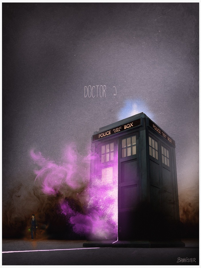
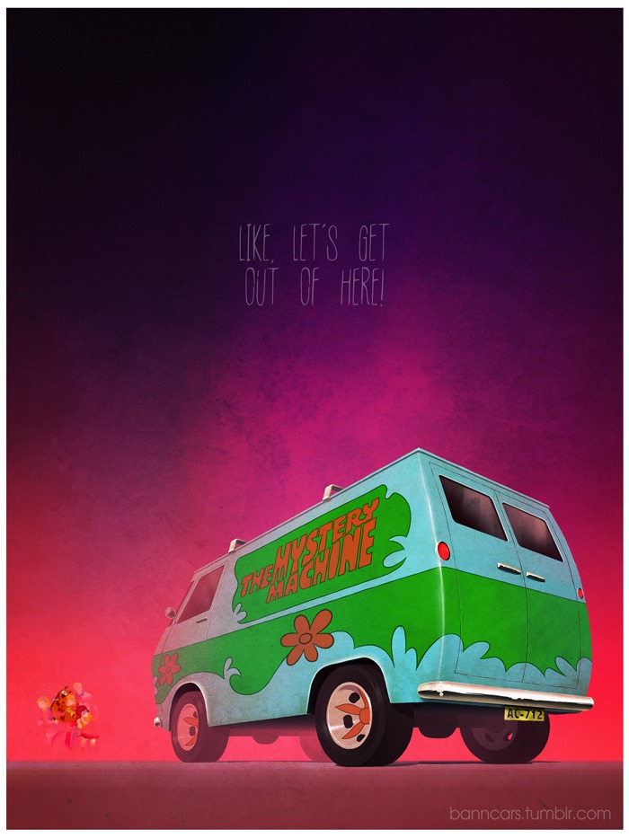
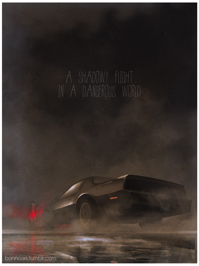
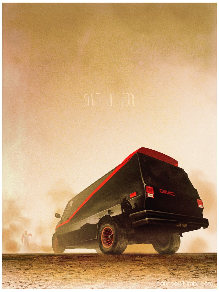
Last month I wrote about DKNG’s Icon series, which illustrated the moving vehicles of famous pop culture franchises. Here’s a similar project, executed with a very different style: BannCars depicts modes of transportation from movies, television and video games, all from a single dramatic, consistent perspective.
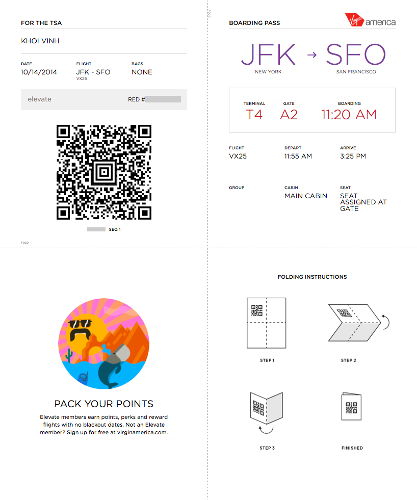
I just checked in online for a flight to California tomorrow on Virgin America, and was pleasantly surprised by how cleverly their boarding pass is designed. It’s recognizably optimized for a standard letter-sized sheet of paper, with instructions to fold the printed sheet into quarters.
Over the years a number of enterprising designers, including Peter Smart, Timoni West, Tyler Thompson and others, have taken it upon themselves to propose redesigns for the hoary old boarding pass. The results have generally been fascinating, at least. But Virgin America’s designers (probably a team from an agency?) may have edged them all out, I think, if for no other reason than it acknowledges that these documents almost always get folded up for convenience.
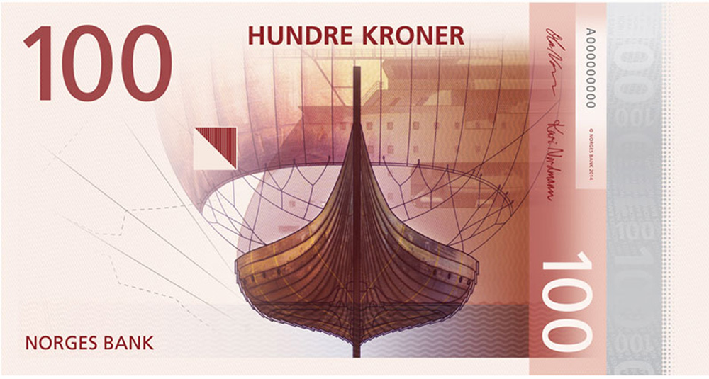
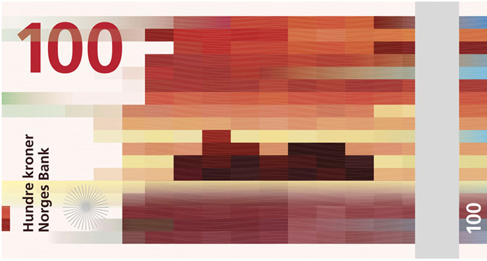
Everyone complains about how ugly American greenbacks are, and I agree with them, but I find many banknotes from other countries to be indistinguishable from one another. The view of the Norwegian krone shown above suffers from that, in my opinion. The other side of the note though, as designed by Snøhetta is a different story. It’s a highly abstract, pixelated pattern inspired by ocean waves. It’s gorgeous.
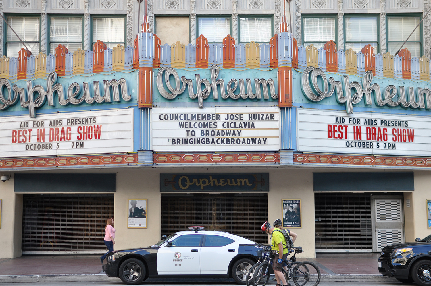
Last Sunday, while I was in L.A. for Adobe’s MAX conference, a ten mile stretch of the city was shut down to auto traffic as part of the city’s ClicLAvia series, which runs a few times a year. It’s a chance for Angelenos to experience the city on foot or bicycle—rare for L.A.—and it feels like a combination of street party and parade.
I was staying at a hotel not far from the route, so I took a stroll north on Broadway to meet some friends who were starting out from Echo Park. I was surprised to discover how beautiful the architecture was; Broadway, aptly, used to be the city’s theater district, and there are still lots of old theater fronts along it. Many of them have been repurposed for other businesses, but their distinctive marquees remain. I took a bunch of pictures, which you can see after the jump.
I’ve been really flattered and gratified by all of the reactions to Project LayUp, the iPad app for design brainstorming that I’m working on with Adobe. We’ve been toiling away on it for so long in secret that sometimes it’s been hard to know if we were just talking in abstractions, without any real sense of whether the app was solving a real world problem.
As a product designer, the biggest fear is that you’re creating a product for nobody. Even after Adobe ran a study in which we put our early prototype in front of real users for their reactions, the feedback was encouraging but not particularly definitive. Most of them said, “There’s something interesting here that people might use—I might use it myself, but not necessarily.” After hearing that, I worried that Adobe would pull the plug, but to my relief their belief in the idea never wavered. In fact, that was when they expanded the team.
Of course, positive reactions to a five-minute demo don’t necessarily translate into marketplace success, or even into real users. But after working for so many months in relative isolation, and after having also built my share of software products that never really caught the imagination of the public, I’m going to let myself enjoy the good vibes right now, whatever may come.
After my demo at Adobe’s MAX 2014 conference, and after blogging about the project yesterday, we got a flurry of enthusiastic tweets and comments. The thing that’s been most striking to me about the common sentiment among them is that people seem very eager to get their hands on LayUp. That’s still kind of shocking to me.
So I decided to collect a whole bunch of them for posterity; you can see them after the jump. Viewed as a group like this, it’s remarkable to me how the message is so consistent: “Finish it and ship it!” We’re not as close to being able to do that as we’d like, but believe me, we’re definitely motivated to do so.
A few people have mentioned to me the obvious links between Project LayUp and Mixel. As I mentioned in my post, the former was heavily influenced by lessons from the latter.
From time to time people send me links to various apps that also share some of the same DNA as Mixel. Here’s one that was sent to me today: Curator is an iPad app that lets users create what are sometimes called “mood boards.” A board starts with a grid of twenty-five empty boxes; users fill each box with whatever inspiration or reference material they like—images, Web pages, blocks of text.
Curator is very well designed and easy to use, though it seems to beg for an integration with the current mother of all visual inspiration, Pinterest. That service is so remarkable because almost anything that you can think that you’d want is already there, pinned and tagged by one of Pinterest’s millions of industrious users. A tool like Curator, perhaps with the added ability to combine multiple boxes into bigger boxes, would be a fantastic way to tailor a Pinterest board into something more fit for presentation. In case it wasn’t already obvious, this is something I’ve wanted to do with my Pinterest boards for some time.
Last year, Scott Belsky, co-founder of Behance and VP at Adobe, reached out to me for a chat about Creative Cloud. The perception at that time was that a CC subscription was merely a scheme to allow Adobe to charge repeatedly for software that previously users could buy just once. That’s what he wanted to discuss.
Scott told me that Adobe wanted to upend that notion by launching a new breed of more lightweight, more varied apps that could all live on top of Creative Cloud and benefit from the uniquely connected workflow that a more robust version of the service would allow. The new apps would be free or low cost, would all tap into shared resources stored in the cloud, and perhaps one day would even come from third-party software publishers. The goal was to shift the perceived center of a CC subscription’s value away from the company’s marquee apps—Photoshop, Illustrator, Premier, etc.—and move it to the CC ecosystem itself.
We started to see the fruits of that strategy in earnest yesterday, when the company released a cavalcade of new and updated mobile products, as well as its Creative Profile, a new centerpiece for the service that gives users almost universal access to their design assets. My friendship with Scott aside, I’m shocked by how fully Adobe has executed on this cloud- and mobile-centric strategy. Adobe has rarely been thought of as a particularly light-on-its-feet company, but in less than two years they have moved almost their entire ecosystem and workflow into the cloud.
In that conversation, Scott also asked me if I had any ideas for apps that could live on top of this new phase of Creative Cloud. I told him that, after Mixel, I still had lots of ideas about the still untapped potential of the iPad. We’ve seen that device hit some “speed bumps” in its previously stratospheric growth this year, and I believe the reason is because we still haven’t fully unlocked its power.
The use case for consuming things on the iPad has always been clear, but the use case for productivity on the iPad has generally been fuzzy. My thinking was that, for visual designers, the iPad could be an ideal platform for a new kind of creative work, one that capitalizes on the device’s unique combination of power and comfort. It’s unlikely that you’d ever want to do production-level design work on an iPad, even if you could. But given the right app, the device’s multitouch environment could make for an ideal playground for generating design ideas as smoothly and easily as drawing on paper. I had a vision in my head for something that could be a lot like sketching thumbnails, but richer and more immediate.
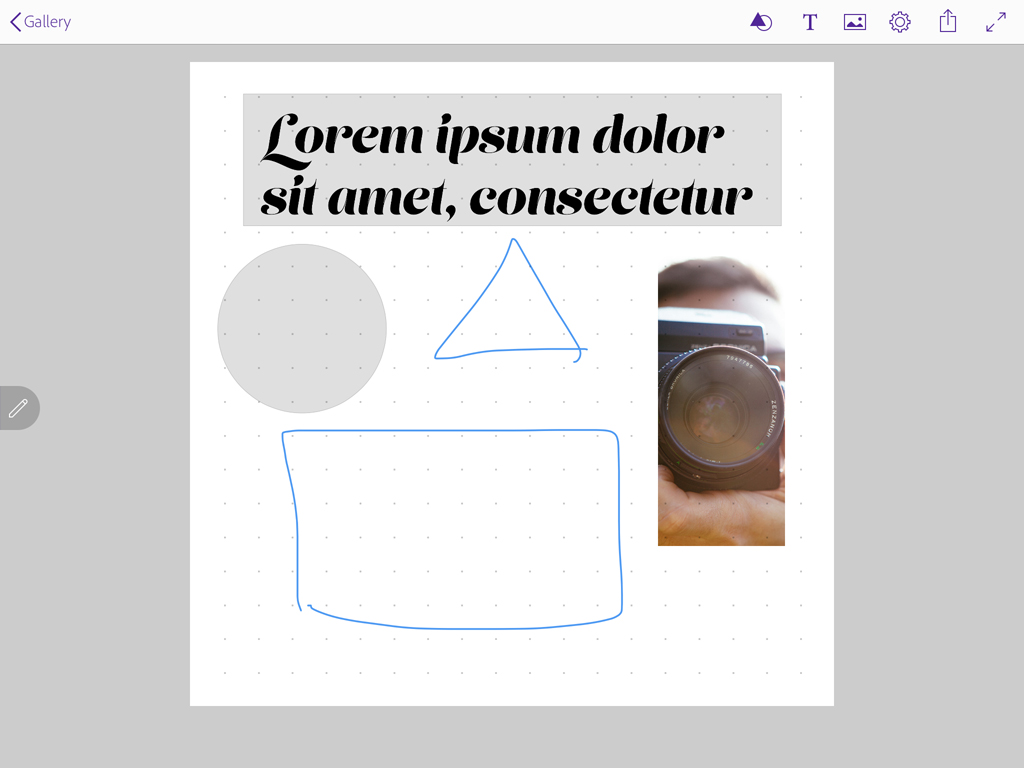
A preview of the user interface for LayUp.
It was maybe a passable idea on its own, but I knew that without Adobe’s participation it would only ever amount to a pipe dream. One of the keys to turning it into a viable product would be fitting it into the way designers actually work. Earlier this year I wrote at length about how important it is to design for existing habits, and that notion was at the center of my concept: the app would need to work seamlessly with the software tools that designers already use. Given the fact that Photoshop, Illustrator and InDesign are often immovably established in most designers’ workflows, it seemed obvious to me that this would be the kind of product that only Adobe could build.
So that’s what I proposed to Scott: a new iPad app that would turbo-charge the brainstorming phase of the design process, and that would play nicely with Adobe’s marquee apps. I called it “LayUp.” To my surprise, he took me up on the idea, and assigned a team at Adobe to start developing it. So for the better part of this year, I’ve been working with that team to bring LayUp to life.
In the course of that collaboration, I’ve been incredibly impressed by the smarts and alacrity that Adobe’s designers and engineers have brought to bear on this project. We began by building a very rough prototype that merely hinted at some of the deep technology and unique UX paradigms that would need to be cooked up, including gesture-based input for creating objects, an “unlimited” history cache, and seamless file format export—it would be a tall order. After we put that prototype in front of some users and validated that there was something promising there, the team got to work. And, though it’s still in development, they’ve basically delivered on all of it, designing and building some truly impressive features. There’s still tons to be done, but I’m very, very excited by its current state.
Yesterday, I debuted “Project LayUp” to the thousands of attendees at Adobe’s MAX conference in L.A. The video of that segment is available here, but for a closer look, I also made the screencast at the top of this post, with basically the same content as my onstage presentation. It shows the principal features of the app working live on a beta version of the app running on my iPad. We don’t have a release date for it yet, but you’ll know as soon as I do when that changes. Have a look, and let me know what you think.
This excellent if flawed short film of Montreal, Canada’s “2014 Mural Festival” is a crash course in a genre of art that I know very little about. Its star is a New York City street artist who goes by the name of “Hanksy” and who appears on camera with a wheatpaste-style head of actor Tom Hanks digitally superimposed on his face at all times. Totally crazy, right? Kids.
The film is essentially a series of interviews with many of the artists participating in Montreal’s celebration of urban muralists—and a few who were not invited to take part—along with Hanksy’s ruminations on what it means to be a part of this kind of event.
I find street murals and graffiti occasionally beguiling, but ultimately they’ve rarely captivated me. Aesthetically the form can be interesting, but I’ve never been particularly impressed by its illicit nature or by graffiti artists’ apparent belief that defacing property is somehow a way of taking back the urban landscape away from corporate billboards and government overlords.
However, what I find even less convincing, and maybe even shallow, are the objections raised in this short film to municipally sanctioned and corporate sponsored events like Montreal’s Mural Festival. Hanksy wonders aloud (and frequently) whether the event represents a corruption of the form’s authenticity. To me though, street art has always been a kind of a test lab for commercial trends—its whole purpose, whether conscious or not, is to create a visual language for selling overpriced tee-shirts, baseball caps and other branded lifestyle products to kids with disposable income. As proof, note that this video was apparently paid for and presented by the street wear brand The Hundreds.
All that said, it’s a well made and an entertaining video. It was also directed by Nicholas Heller, whose excellent “No Your City” series I wrote about back in March.