is a blog about design, technology and culture written by Khoi Vinh, and has been more or less continuously published since December 2000 in New York City. Khoi is currently Principal Designer at Adobe. Previously, Khoi was co-founder and CEO of Mixel (acquired in 2013), Design Director of The New York Times Online, and co-founder of the design studio Behavior, LLC. He is the author of “How They Got There: Interviews with Digital Designers About Their Careers”and “Ordering Disorder: Grid Principles for Web Design,” and was named one of Fast Company’s “fifty most influential designers in America.” Khoi lives in Crown Heights, Brooklyn with his wife and three children.
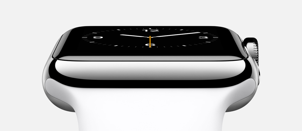
As first sight, the look of the Apple Watch struck me as boxy and inelegant. Its vaguely space age-y curves seemed like the antithesis of what I personally favor in watch fashion, which is something more conservative. But I was surprised to find that the watch itself complemented its various flavors of watch bands pretty well; whether paired with a more traditional or a more sporty band, the essential design of the watch still made sense. That’s impressive.
I still have to reserve judgment on whether I personally like the design or not, though, as the thickness of the watch itself seems greater than I think I would like, at least in photos. The “crown” dial also seems optimized for utility and usability—not an inherently bad decision, but one that might make it less aesthetically desirable overall.
Finally, I feel somewhat vindicated by the three “curated” styles of Apple Watch—which basically map to everyday wear, athletic wear and luxury wear—as well as the wide variety of watch bands that the company will sell at launch. Their existence goes to points I’ve made about the fashion imperative for a successful wearable, and how different that is from creating products predicated primarily on technological innovation. Back in July, I argued that Apple bought Beats by Dr. Dre partly for their understanding of this problem, and I wrote this:
iWatch, if it exists, will need to be more of a fashionable good than Apple has ever created before; fashionable goods depend in part on variability in order to satisfy individualized consumer expression; and creating variability at scale is the key economic challenge of wearables.
There aren’t quite as many SKUs for the Apple Watch as there are, say, in the Nixon watches catalog, but there are far more variants on offer than for any Apple product that’s ever come before. And remember, this is a company that, at the onset of its comeback, prided itself on selling fewer things, on an almost flagrantly reductive product matrix.
This reflects, I think, Apple’s keen understanding that with this watch it has gotten itself into the business of fashionable goods. From today’s evidence, from the variety on display and the close attention apparently paid to the aesthetic, non-utilitarian aspects of the product, the company has seemingly made that necessary, decisive step towards thinking about the kind of products it makes in a substantially different way. Which is apt.
My friend Matt and I put Facebox on sale earlier in the year and it was a big hit, so we’re doing it again. Here’s the deal: the full pack is usually US$35, but today and tomorrow only you can get it for US$15. Wednesday, the price goes up by five dollars to US$20 and stays that way through Thursday; then on Friday it goes up another five dollars to US$25—until Saturday morning (New York time), when it’s full price again.
For those who aren’t familiar: Facebox is composed of fifty high-quality shots of real people that Matt and I took last summer on the streets on Manhattan. Each avatar comes cropped in three shapes — squares, circles and rounded rectangles — and there are files and templates for Photoshop, PowerPoint, Keynote, OmniGraffle and Sketch. Having these on hand makes life much easier when you’re preparing mockups for Web sites and apps, or putting together business presentations, because all of the images are rights-cleared and royalty-free (unlike many other similar products you can find out there). All told, this is a great deal at full-price, but it’s a steal at US$15. Get it before the price goes up!
I initially thought this video was just a demonstration reel for Freefly Systems’ camera movement equipment, and was prepared to dismiss it as technological showboating. But as its four-plus minutes of slow-motion footage shot on the streets of New York City rolled by, I came to realize that it was capturing details that I hadn’t seen before, even after living in the city for many years—tiny, delicate moments, some of them unexpectedly abstract, hidden within the hurried onslaught of urban life.
Also, here is a behind-the-scenes piece on the making of this video.
Update: My friend Joe Holmes pointed out a very similar piece from artist James Nares—like the Freefly demo reel above, Nares’s is also called “Street.” It’s more extensive though, at a one-hour running time, and was shown at The Metropolitan Museum of Art last year. Here’s a short excerpt; the similarities are striking, if not suspicious.
Here’s something I’ve been eagerly anticipating for years: the home video release of the 1960s “Batman” television series. Long tied up in legal wrangling, all 120 episodes of the show (plus special features) are now, finally due for release this November.
This show was my introduction to the character as a kid; I’d hunt the TV listings to see if any local channels were showing it in syndication. I have distinct afterschool memories of vainly trying to pull in a clear signal from a station running the show in the next TV market over from where I lived. The series still occupies a special place in my heart. As those of you who follow me on various social networks know, I’ve used a a cropped image of Adam West in Bat-cowl as my preferred avatar for many years. And for almost as long, I’ve been frustrated that the version of the image I have is of pretty low quality, so I’m crossing my fingers that I’ll be able to screencap a higher resolution version when these episodes are released.
Speaking of things Adam West, I was just made aware of the film “Starring Adam West,” a documentary of how West managed to persevere during the lean years following the show’s cancellation, when he found himself painfully typecast and short of work.
The movie was being toured for special screenings until earlier this year, but apparently no further showings are in the offing. Find out more at starringadamwest.com.
There’s almost nothing surprising to the idea that someone at this year’s Burning Man Festival brought along a drone and took plenty of aerial footage of the craziness—it’s the sort of thing we expect nowadays, and it would be more shocking if that hadn’t happened. All the same, this video is beautiful.
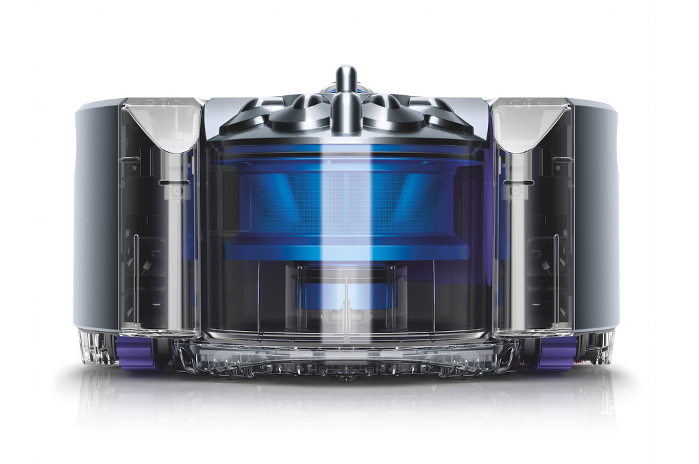
After resisting robot home vacuum technology for years, Dyson is poised to enter the market with the 360 Eye. The company spent sixteen years and US$47 million dollars developing it, or so it says. The promotional video makes a good case for why it took so long and so many dollars:
If priced reasonably, I’m pretty certain this will be a hit. The industrial design, as is to be expected, is sleek and distinctive too—if a bit menacing. That’s not helped, I don’t think, by the terrible product name. It makes me a bit uneasy to think of an autonomous machine freely roaming my house whose chief attribute is that it’s all seeing. Consumer technology has been getting more and more intrusive all the time without us really asking for it; now that nefarious quality is being marketed to us too, it seems.
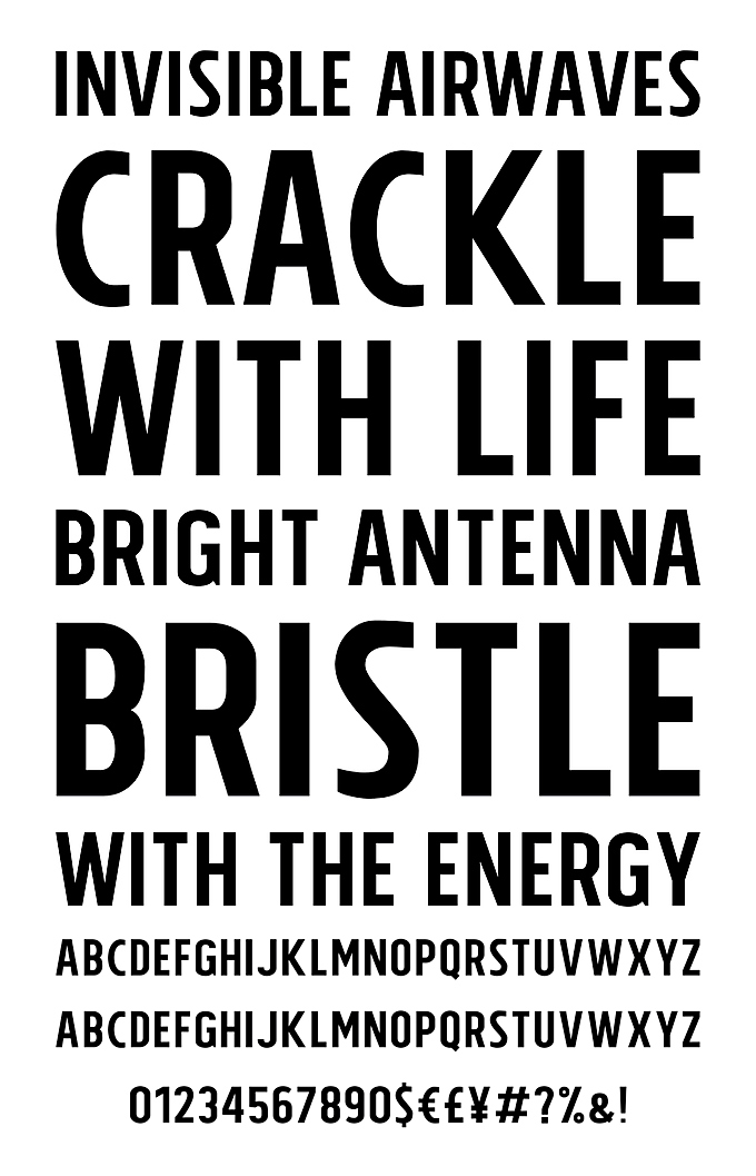
As counterprogramming to yesterday’s post about Tolyer, a comprehensive, affordable but—as it turned out—a not very well designed sans-serif typeface on sale at YouWorkForThem, I thought I’d offer something much classier. Here is the newish Fort typeface designed by Jeremy Mickel, available from Vllg. It’s gorgeous, and like Tolyer comes in loads of variants—forty-eight fonts in all. Some of them are shown here:
The caveat is that the full set of typefaces will set you back US$800. Still, in type, more often than not you really do get what you pay for.
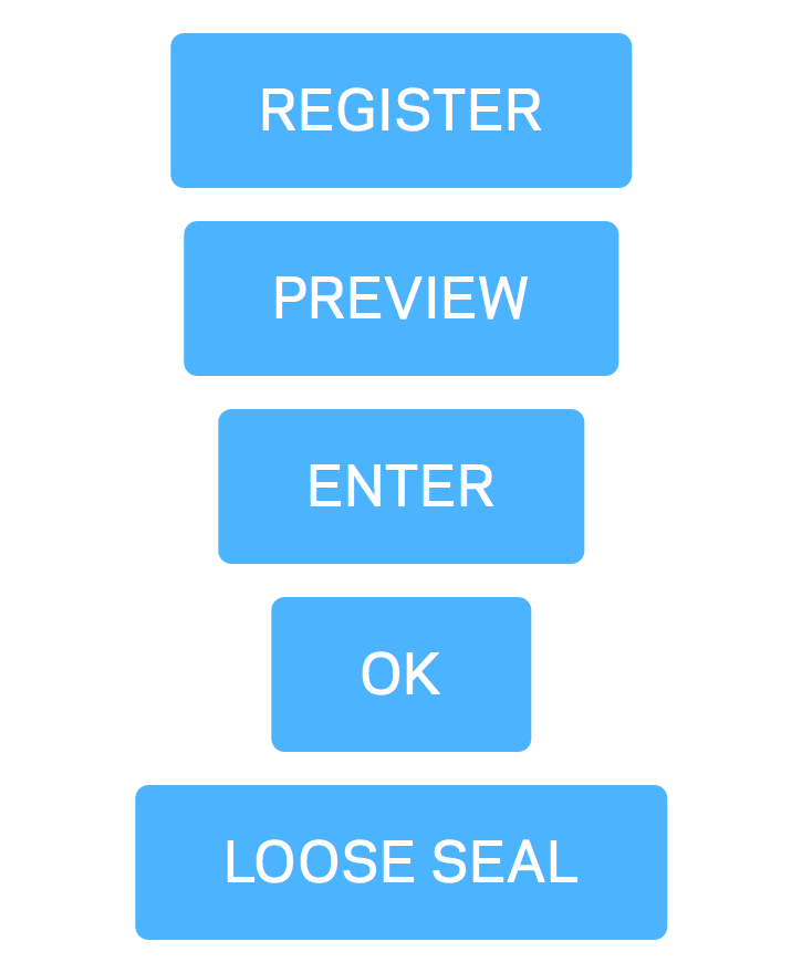
One of the most tedious things about designing interfaces for a living is creating buttons. For example, you might start with one like this:
Soon, you’ll be making variants on it, like these:
When I use Photoshop for this work, each variant requires manually adjusting the left and right padding as the text expands or contracts. It’s very time consuming.
However, with Alexander Kudymov’s Dynamic Button plugin for Sketch, this process is made much, much easier. The padding around the button label is defined in the layer name for that text object. In these examples, the layer name for each text label is “28:80:40:80,” indicating that the button shape should have 28 pixels of padding at the top, 80 pixels on the right, 40 pixels on the bottom, and another 80 pixels at the left (I used over-sized dimensions for illustration purposes). Once the layer name is set, I can type any text I like, then hit the key combination command-J, and the button shape adjusts accordingly and instantly.
Watch this video to see it in action.
This is one of the many reasons I think Sketch is so terrific. Kudmov’s plugin is free and available here.
Chatnarong Jingsuphatada’s versatile type family Tolyer is on sale at You Work for Them for just US$15 until Sep 12. The breadth of the family is impressive: it comes in five weights—Thin, Light, Book, Regular and Bold—with each weight coming in oblique as well as Roman flavors, and within each weight and style, also comes in four different heights. As if that weren’t enough, the family bundle includes ten display variants like 3D, Handmade, Outline, Wood and more. Fifty fonts in total.
Admittedly, Tolyer is not likely to win any awards for the fineness of its details or the distinctiveness of its characters. But it seems sturdy enough, and the sheer utility of having so many variants on hand makes it suitable for lighthearted uses. Also, the price.
Update A few discerning type afficionados have pointed out to me that Tolyer is not very well designed. Upon closer inspection, I have to agree.
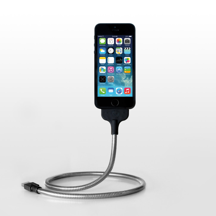
I got this combination Lightning cable/iPhone stand some time ago but only recently started using it regularly. The product is as terrific as it is poorly named—it’s called Une Bobine, which in spite of meaning “coil” in French did nothing for me mnemonically, and I had to consult Twitter to be reminded. (Trying to remembering the manufacturer’s even worse name—Fuse Chicken—was no help either.) Still, great product.
Find out more at—I can’t believe I’m going to type this out—fusechicken.com, or buy it from Amazon (affiliate link).